Brand Development
Visual Identity
Case Study

I developed a refreshed visual identity for Blacksburg Violin Repair, designed to feel professional and approachable while appealing to its primary audience of musicians. The project included a complete logo system, brand standards, stationery suite, and merchandise to ensure a cohesive and recognizable presence across both customer interactions and promotional materials.
For this project 15 designers in total presented work (45 designs total), and mine was chosen by the owner of Blacksburg Violin Repair.
Creative Brief:
Blacksburg Violin Repair Logo & Brand Design
Client: Blacksburg Violin Repair (BVR)
Owner: Sally Mullikin
Established: January 2024
Location: Blacksburg, VA
Project Overview:
Blacksburg Violin Repair (BVR) is a specialized violin family instrument and bow repair shop—the only one of its kind in Southwest Virginia. This logo design project seeks to create a fresh, timeless, and artisan-inspired visual identity that reflects BVR’s commitment to craftsmanship, education, and musical expression.
Brand Values:
Precision and expert craftsmanship
Welcoming and inclusive service
Educating musicians about instrument care
Helping players express their musical voice
Brand Essence:
Approachable Expertise
Target Audience:
BVR serves a diverse clientele, primarily violin and cello players, with an even distribution across age groups. The majority of customers play classical music, followed by folk. Most are hobbyists, with college students as a secondary audience.
Design Preferences:
Must haves:
Fresh and original design
Timeless and clean aesthetic
Easy to read typography
Cool toned color palette
Nature inspired motifs (mountains, botanicals, etc)
Artisan look with bold lines and precision
Possible integration of violin bridge imagery
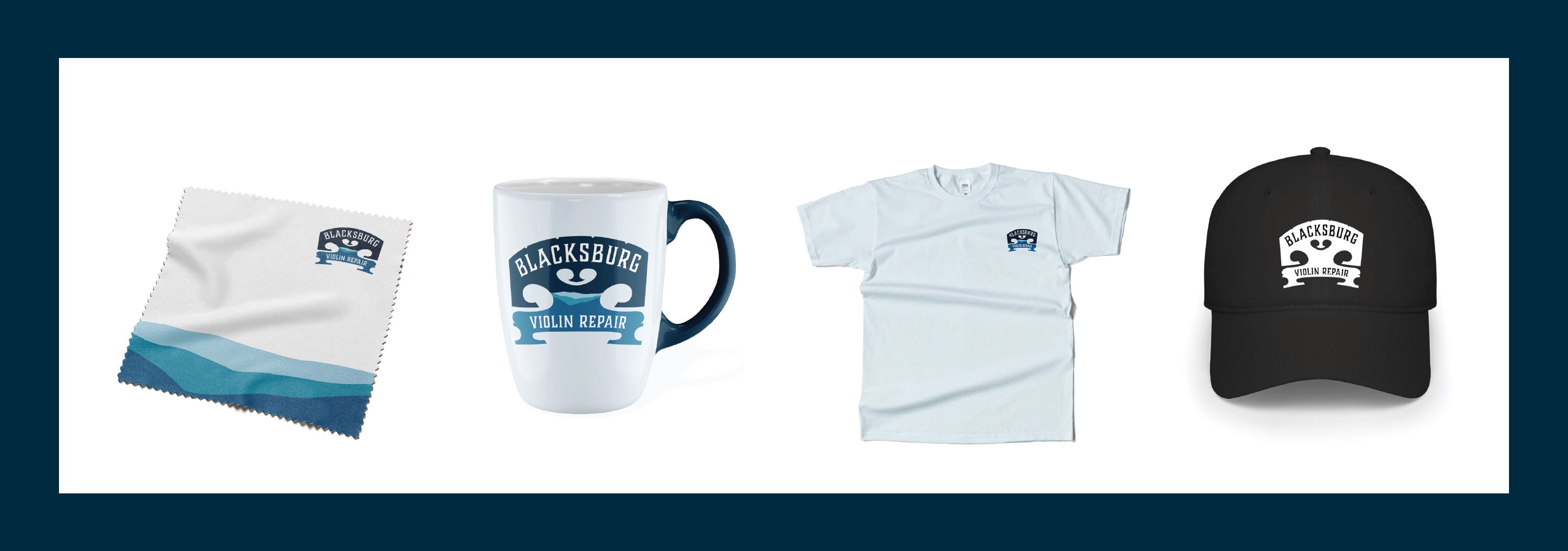
Versatile design for stickers, print, and merchandise
Must avoid:
Overly formal or stuffy feel
Cursive typefaces
Corporate or overly polished feeling
Generic musical motifs (treble clefs, notes, etc)
Busy or overly complex visuals
Proposed Logo Applications:
Business cards
Flyers & print advertisements
Client communications
Stickers (a favorite among musicians for their cases)
Instrument polish cloths
Possible signage and apparel (T-shirts, etc.)
Competitive Landscape:
While BVR has no direct competitors in instrument repair, it shares clientele with:
Bridge Kaldro Music
Star City Music
Fret Mill Music Co
A strong brand identity will help differentiate BVR from these broader music retailers and emphasize its specialized expertise.
Inspiration & Final Thoughts:
Sally Mullikin, BVR’s owner, has carved thousands of violin bridges—an artisan’s signature mark. For her, being able to stamp her own name on a bridge represents the milestone of establishing her own shop.
A well-crafted logo should reflect this pride and precision, incorporating elements like the violin bridge or a case silhouette, while maintaining a balance of elegance and artistic flair. The result should be a design that is instantly recognizable, visually compelling, and perfect for stickers, signs, and promotional materials.
Logo Options Presented:
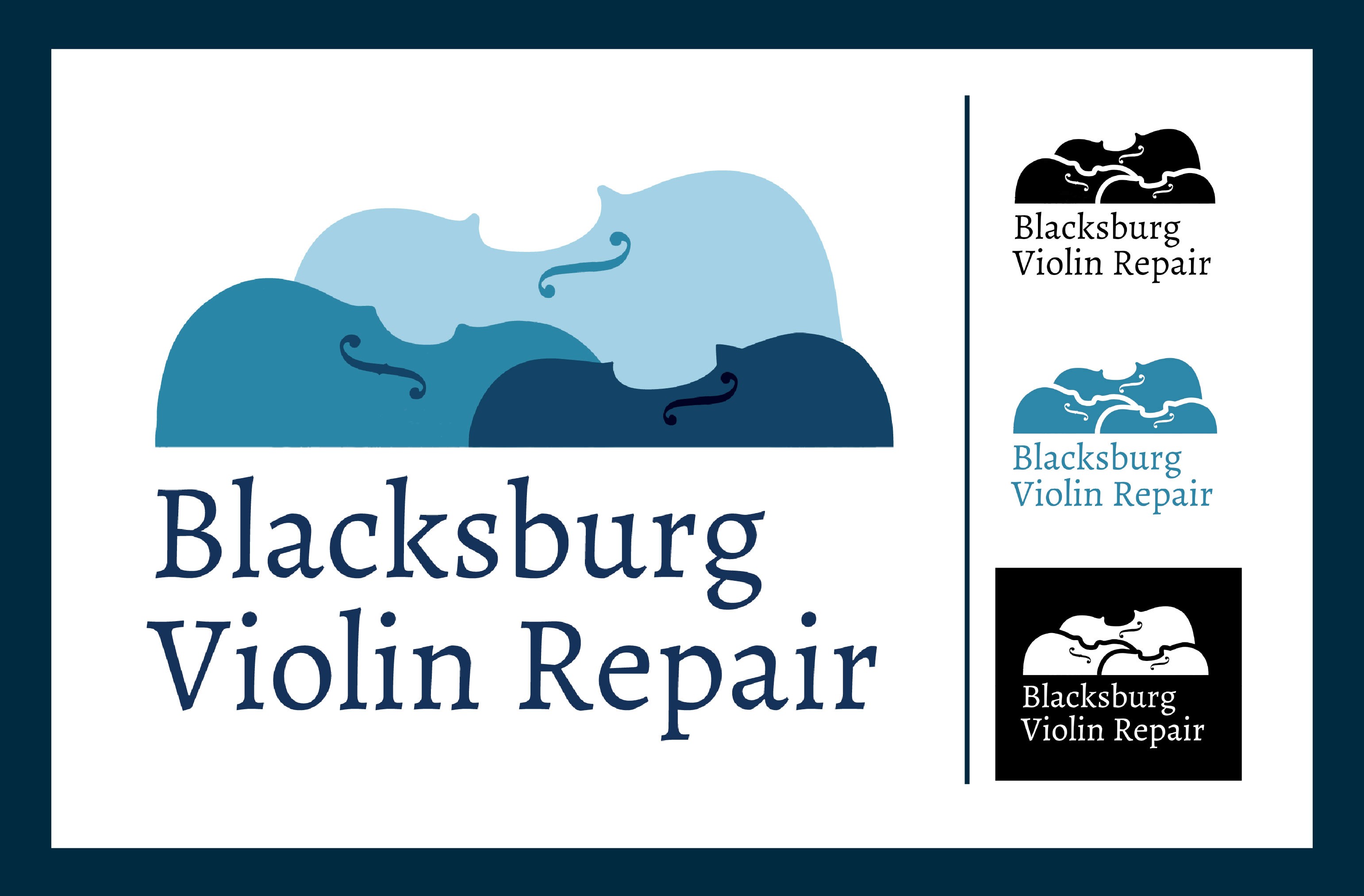
Logo option 1: This logo direction focuses on creating a welcoming and inclusive feel, reinforcing a sense of community that aligns with the brand’s goal of serving individuals of all skill levels. The cool color palette keeps the look calm and cohesive while reflecting the client’s preferences, and the simplified icon adds a modern, approachable touch.
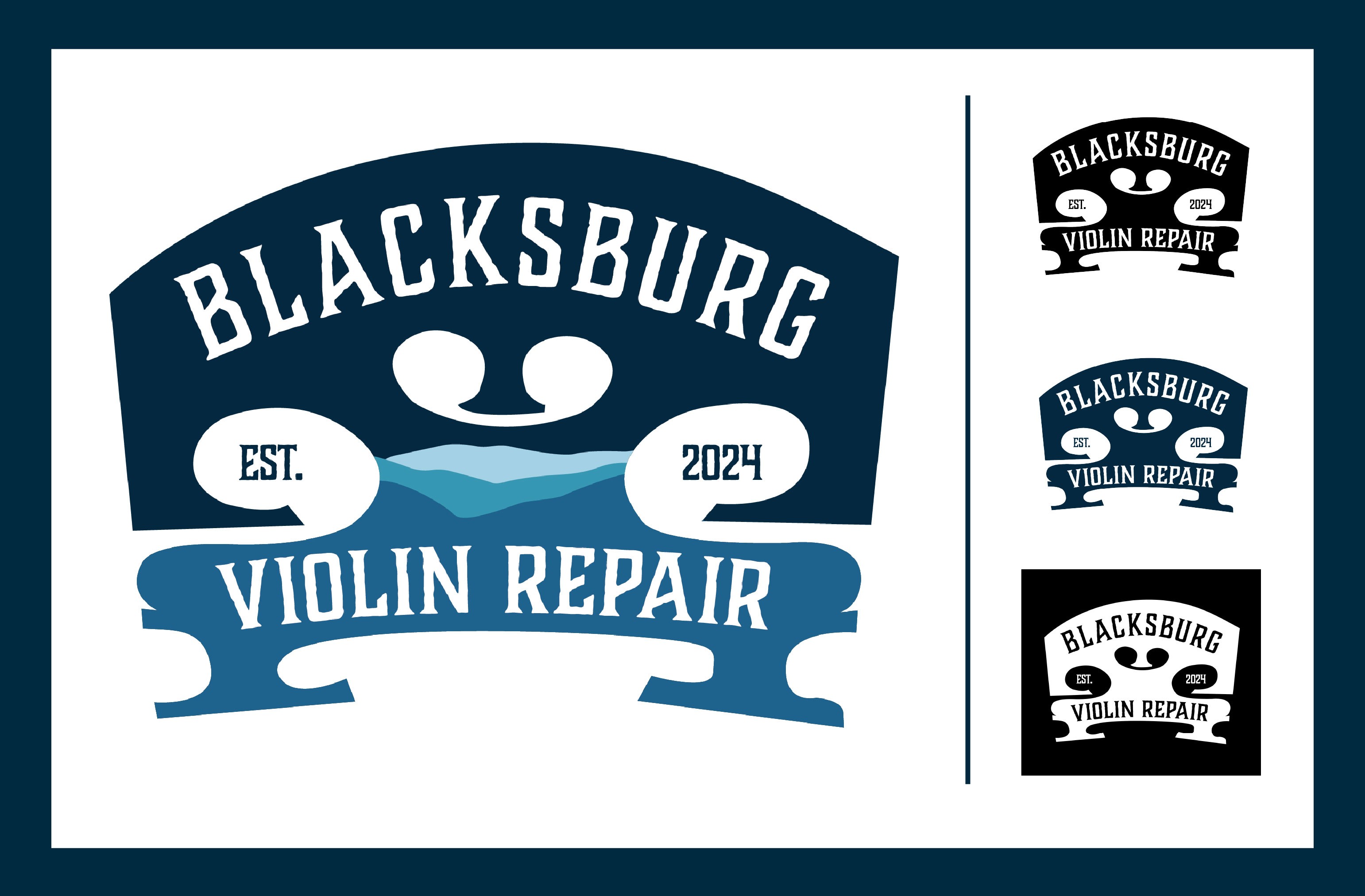
Logo option 2: This design strongly reflects BVR’s values of exceptional craftmanship. The violin bridge, Sally’s personal and professional signature, is front and center, with a creative use of mountain imagery embedded within. It communicates “handcrafted” and “love of nature” very clearly. The typography is strong and readable while keeping a vintage-meets-modern character. This design is also bold and memorable.
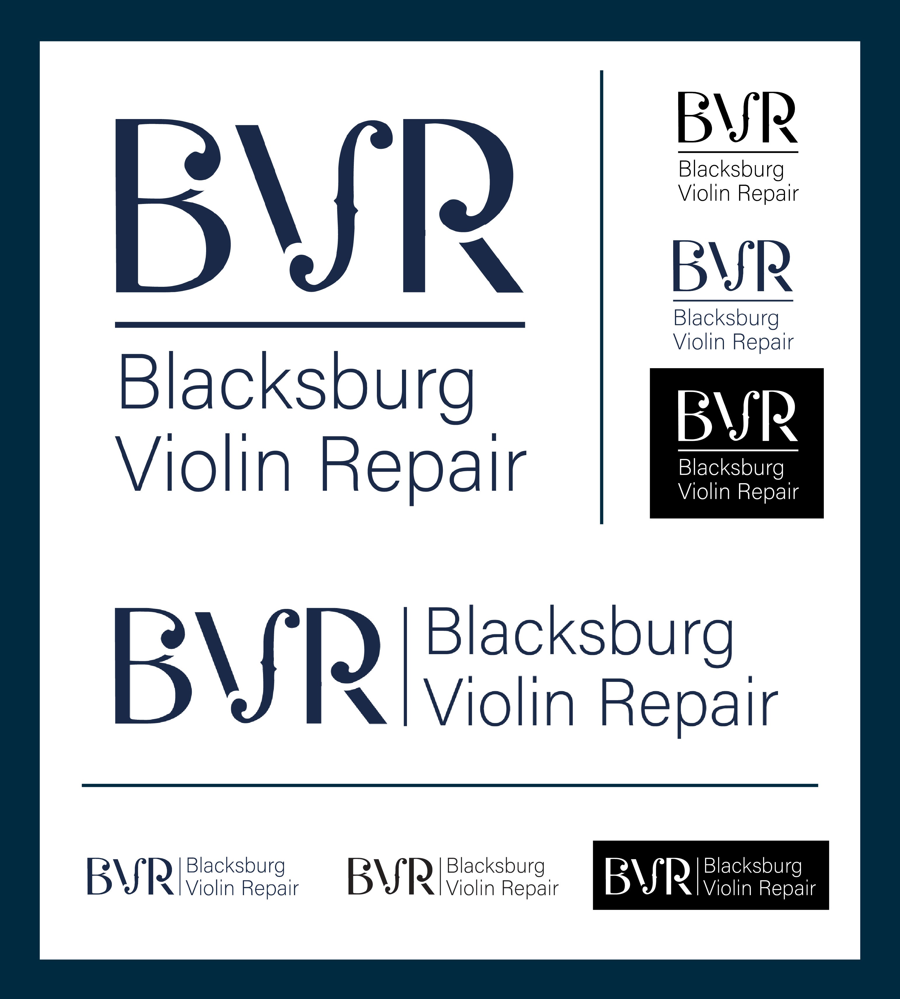
Logo option 3: This version is clean and sophisticated while still referencing the violin family through the f-hole shapes in the letters. It will scale well and look very polished on digital or printed media.
Final Branding:
Final Logo:
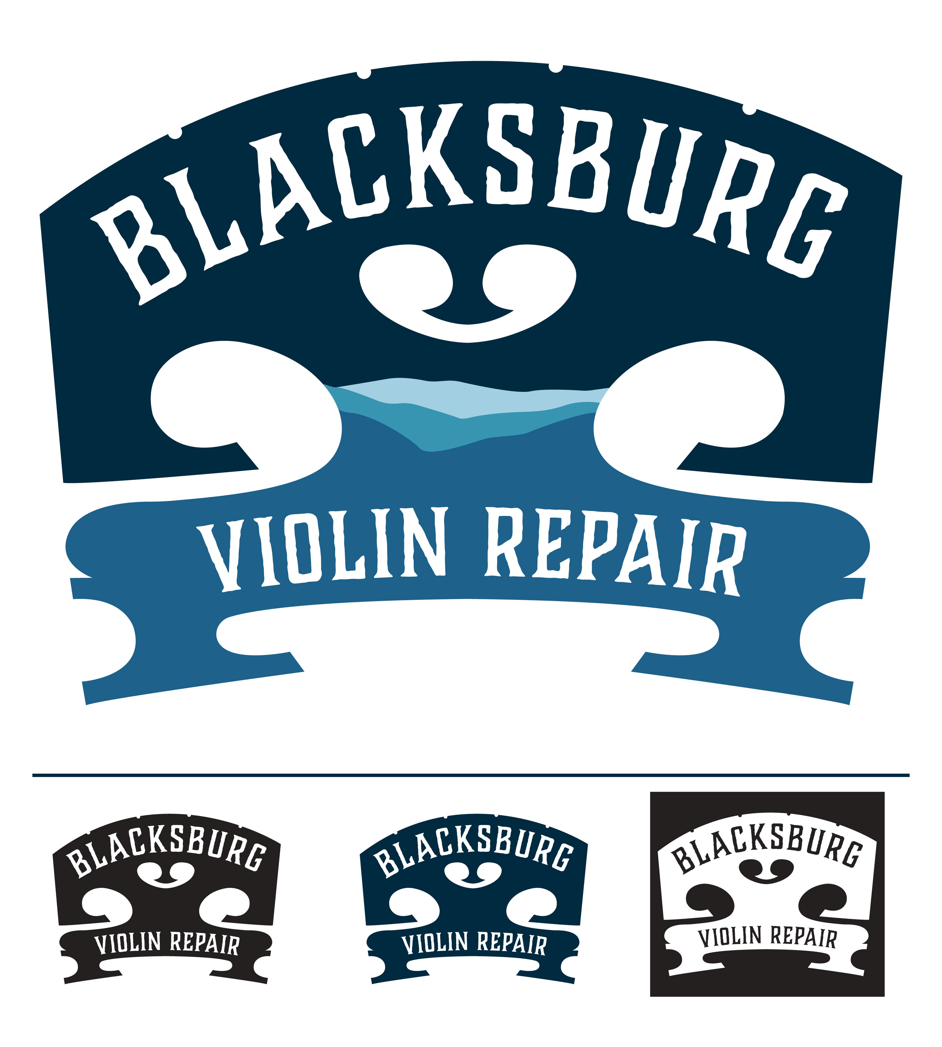
The second logo option was chosen. Minor tweaks to the bridge shape were made to better reflect the actual bridges that BVR make by hand, and the established date was taken out of the design.
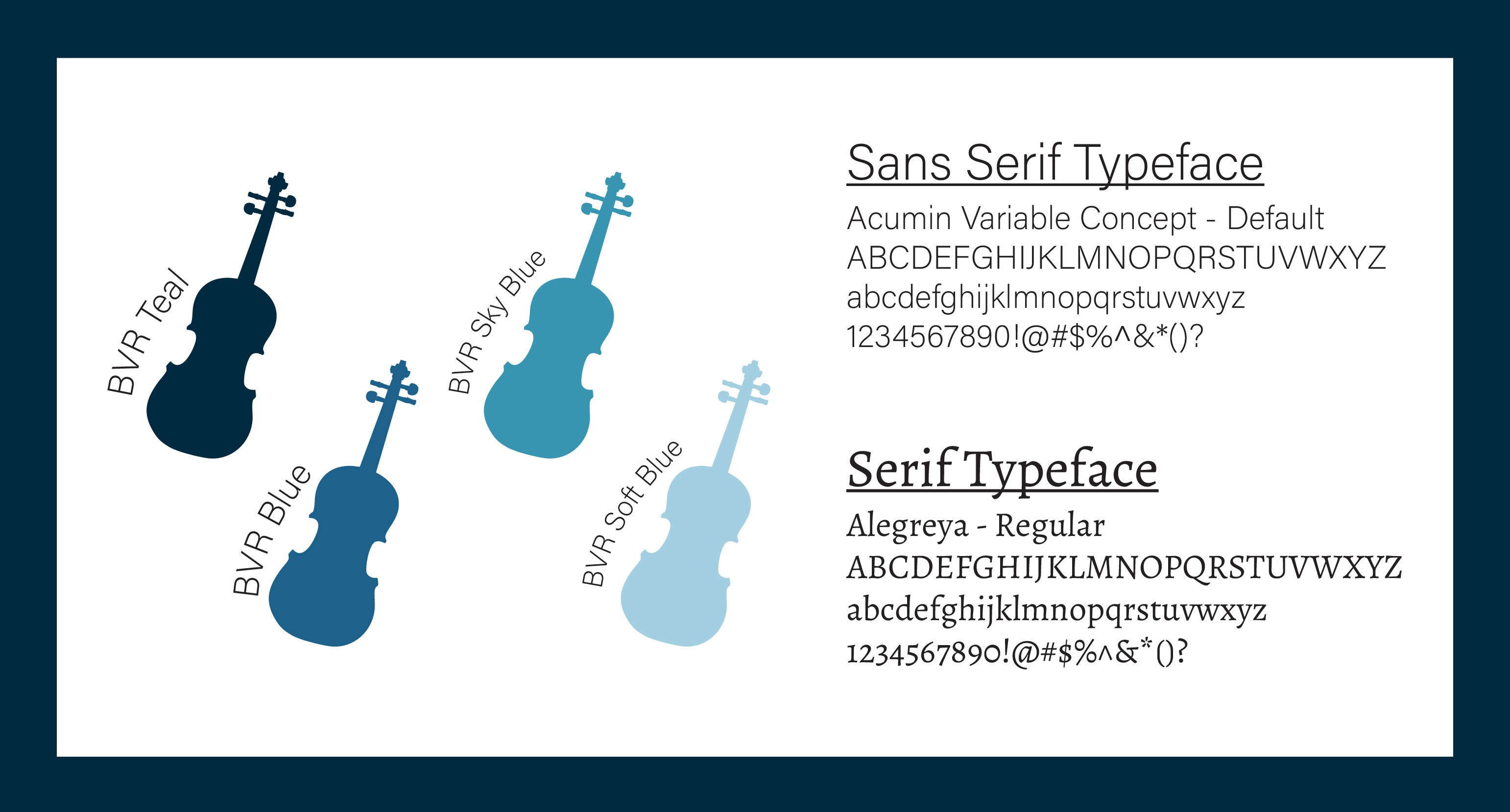
Corporate Typefaces and Colors:
Stationery Suite:
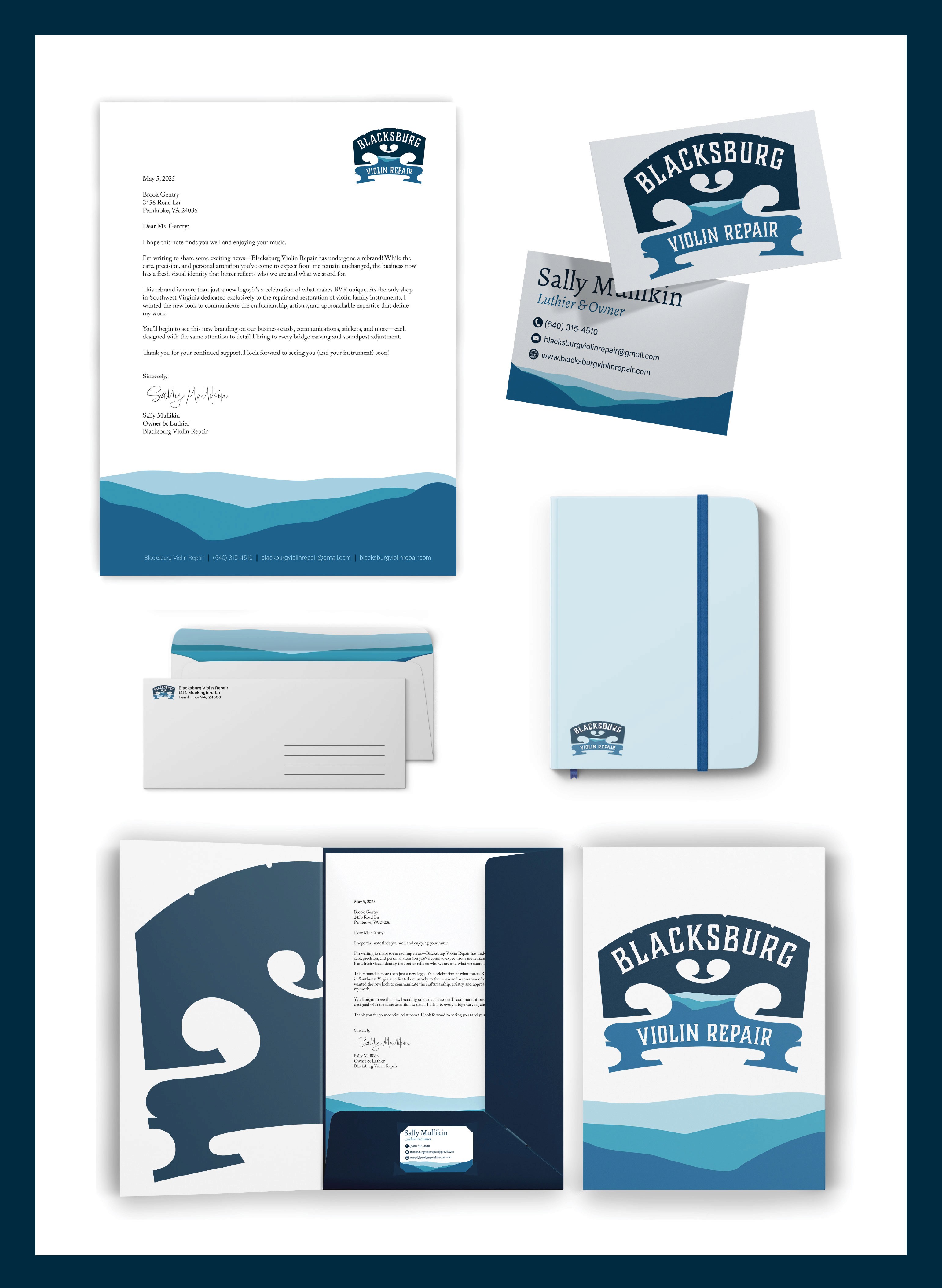
Specialty Application: