Brand Development
Visual Identity
Award Winning
Case Study

I developed a refreshed visual identity for the Radford University Foundation, which focused on creating a modern, trustworthy brand that resonates with its primary audience of donors while maintaining a clear connection to Radford University. The project included a comprehensive logo system, detailed brand guidelines, and supporting materials to ensure the Foundation can present a consistent, professional identity across all communications and platforms.
Creative Brief:
Radford University Foundation Rebrand
Overview
The Radford University Foundation is a nonprofit organization established in 1973 to support and enhance the educational, cultural, and social experiences at Radford University through financial contributions, scholarships, and other valuable resources. It serves as a bridge between the University and its donors, funding scholarships, campus enhancements, and strategic initiatives that empower students and strengthen community ties. The Foundation plays a vital role in Radford’s success by responsibly managing more than $100 million in assets and awarding over $2.6 million in scholarships each year.
The Foundation seeks a refreshed logo that modernizes its identity. The new logo should reflect the Foundation’s connection to Radford University while standing out as its own trusted institution, symbolizing its role in financial stewardship, innovation, and donor accountability.
Project Objectives
Develop a modern logo that connects visually with Radford University while establishing the Foundation as an independent, trusted organization.
Create a visual identity that resonates with donors and communicates trust, transparency, and wise investment of resources.
Brand Identity:
Essence: Trustworthy, accountable, and forward-thinking.
Mission: To support the success of Radford University and Radford students through wise stewardship of donor contributions, ensuring funds are managed with transparency and impact.
Values: Financial accountability, transparency, innovation, strategic impact, and community engagement.
Target Audience:
Primary audience: Current and prospective donors, including alumni, philanthropists, and community partners.
Secondary audience: University stakeholders and the broader community invested in Radford University’s growth and success.
Competitive Landscape:
The Radford Foundation operates in a landscape where many university-affiliated foundations use traditional, formal design language. To stand apart while still maintaining credibility, the Foundation seeks to:
Connect visually with Radford University through typography, recognizable visuals, and color palette.
Balancing modern design sensibilities with a sense of heritage and institutional trust.
Create brand appeal for both long-standing donors and newer, forward-looking supporters.
Design Considerations:
Connection to Radford University: Stylistic and design choices should echo Radford University branding while remaining distinct.
Iconography: Consider using visuals that are recognizable to those familiar with campus and university branding, yet novel and distinct for the Foundation.
Modern Appeal: Ensure the design feels contemporary and professional to reflect innovation and modernization.
Typographic Harmony: Use a typeface reminiscent of Radford University’s visual identity to subtly connect the organizations, while altering aspects to indicate independence.
Convey responsibility: Maintain the look and feel of a trusted financial institution.
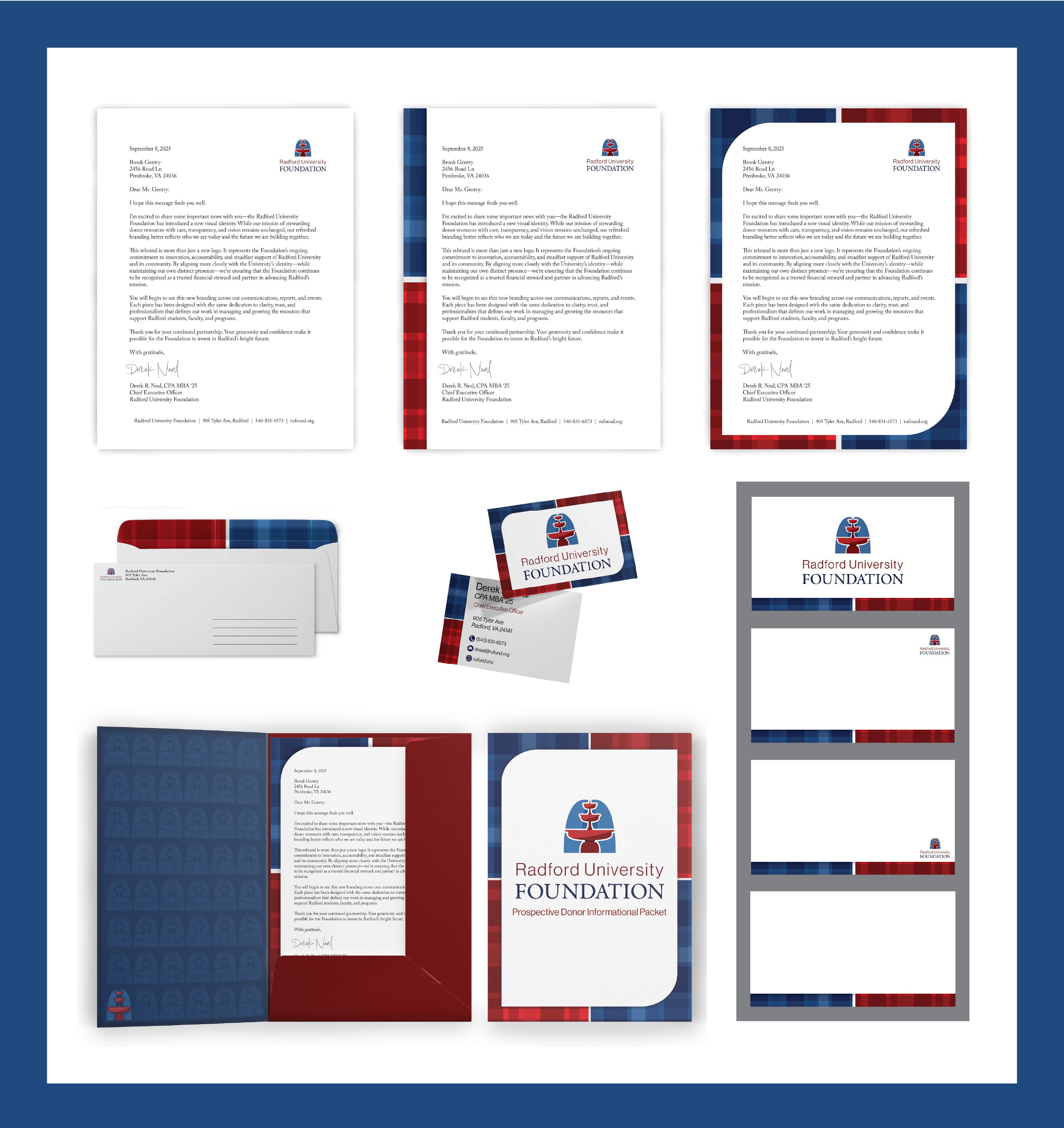
Key Applications
The logo must be adaptable and impactful across:
Donor-facing communications, including reports, brochures, and presentations.
Stationery including letterheads and business cards
Digital platforms, including the Foundation’s website and media posts.
Event signage, including fundraising campaigns and promotional materials.
Indoor and outdoor office signage
Key Message:
The Radford Foundation’s logo should communicate trust, transparency, and accountability while evoking innovation and forward momentum. It should evoke donor confidence and visually reinforce its relationship with Radford University.
Sketches:
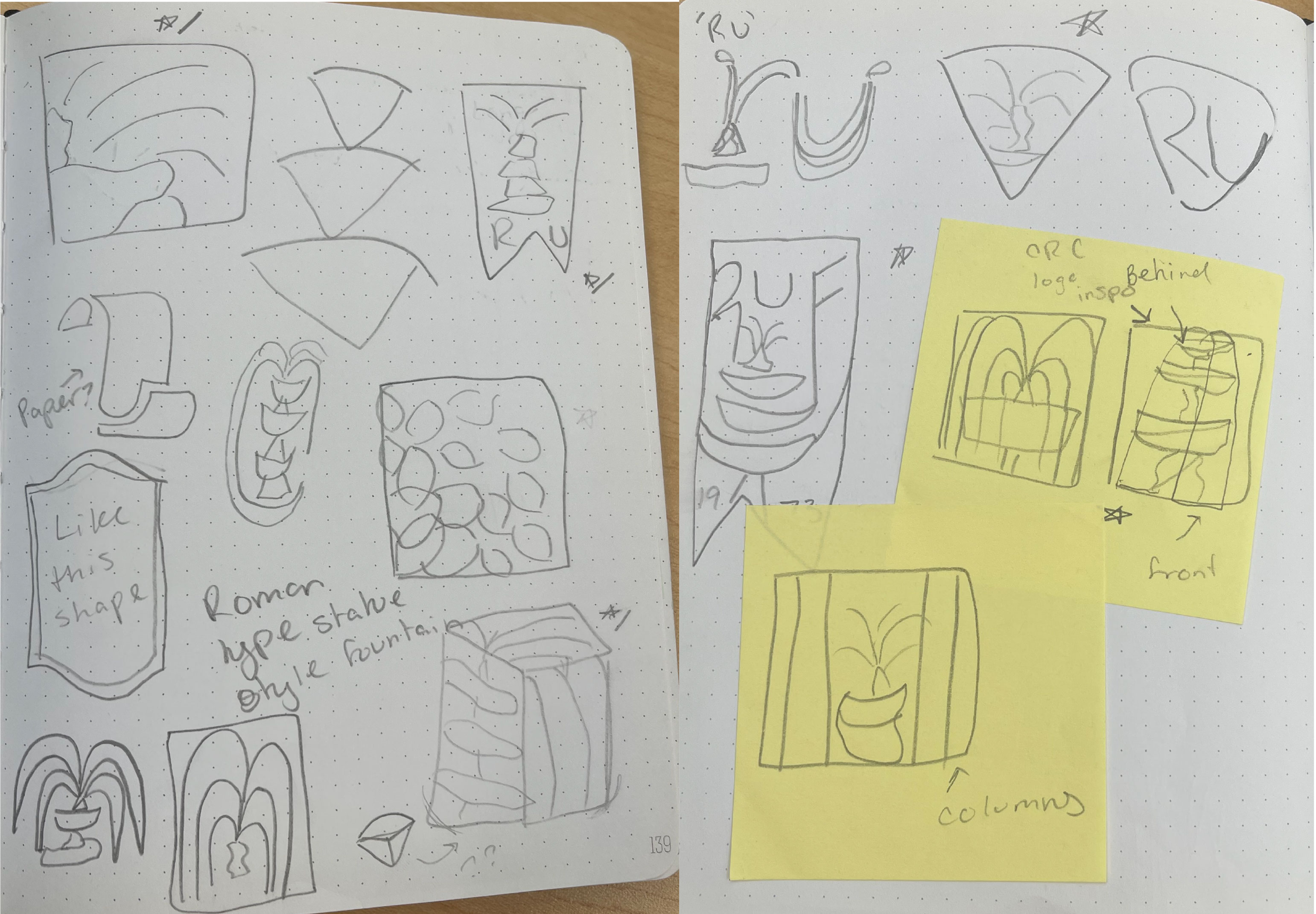
Logo Options Presented:
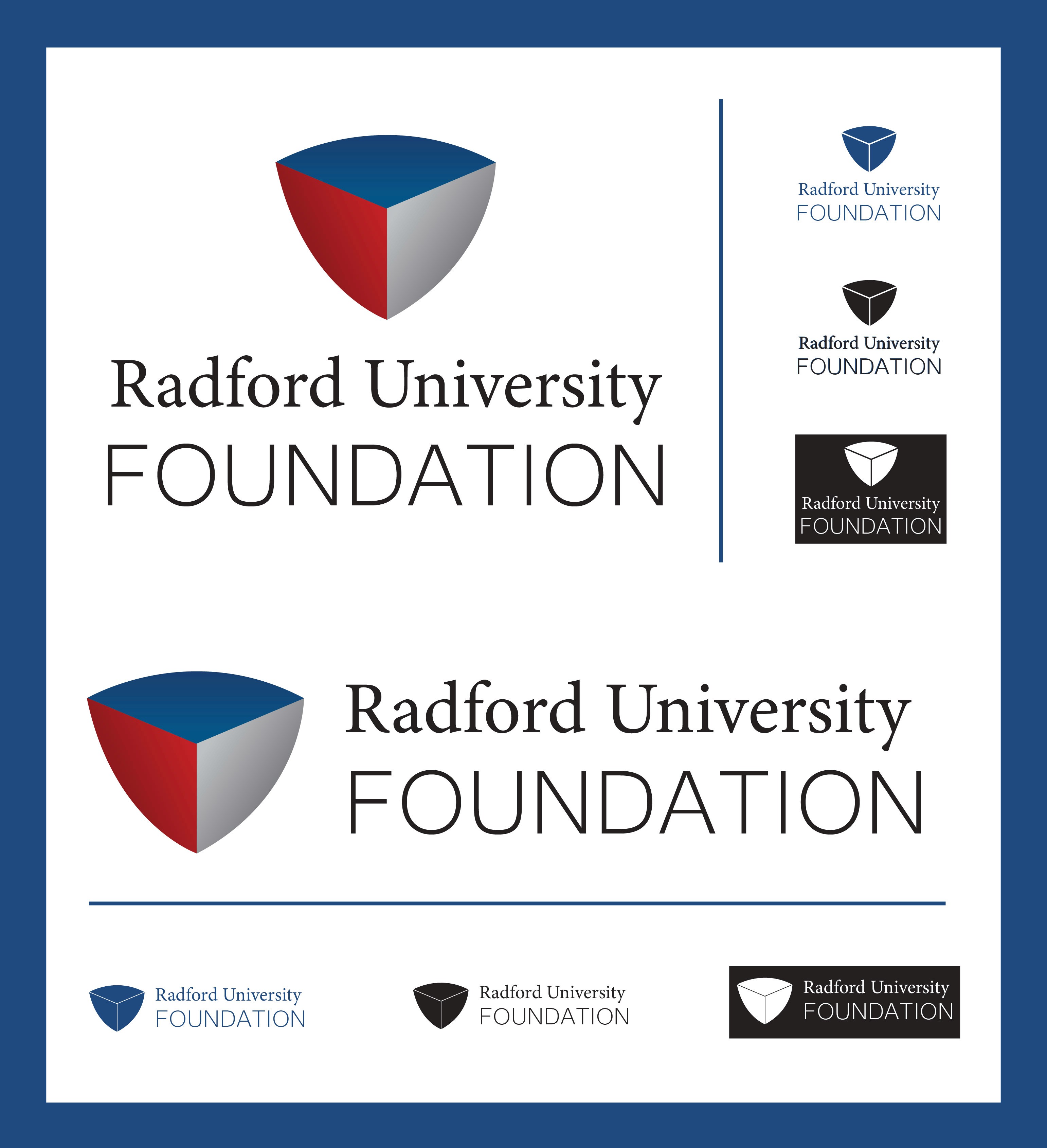
Logo option 1: The logo keeps Radford University’s familiar badge shape but gives it a modern, three-dimensional look. The shape is split into three parts, showing the Foundation’s main goals: innovation, financial transparency, and ongoing support for the University and its community. Using the badge shape connects the Foundation to the University, while the updates make it different and easy to tell apart.
The colors—red, blue, and gray—combine tradition with professionalism. They match the University’s colors, showing the Foundation’s partnership. Soft shading in the badge helps the logo look good in print, online, and on physical signs.
The type also shows both tradition and progress. “Radford University” uses the official serif font to keep a clear link to the school. “Foundation” uses a simple, modern sans serif font for contrast and to suggest forward thinking. Together, the two styles honor the University’s history while showing the Foundation as its own strong, approachable identity.
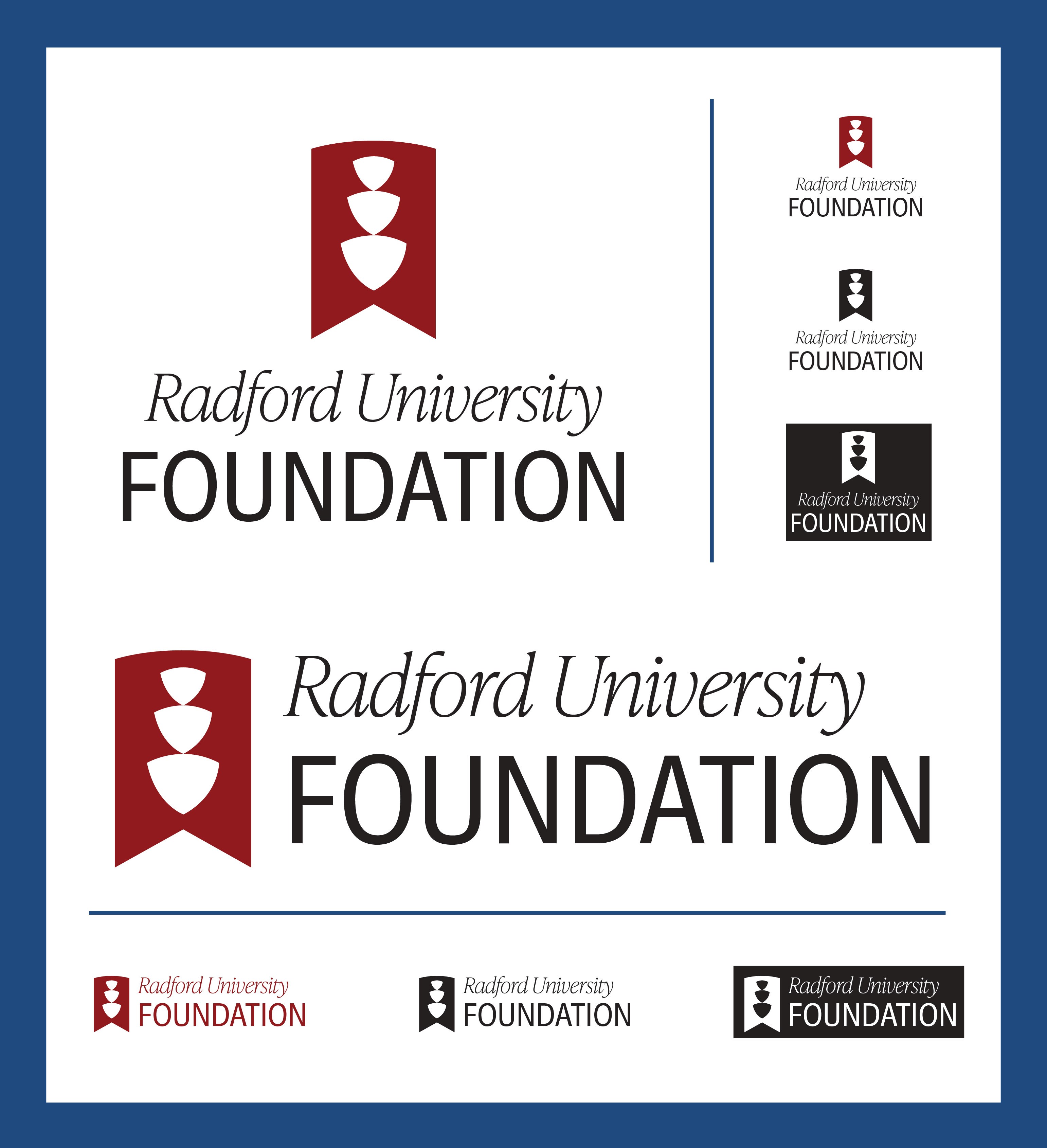
Logo option 2: This logo builds off Radford University’s existing visual style by using a banner shape that connects it back to the school. Inside the banner, three stacked badge forms create a simplified fountain shape, referencing a campus landmark while also representing the Foundation’s three main focuses: innovation, financial transparency, and continued support. The upward movement of the shapes helps suggest growth and progress.
The use of Radford’s red keeps a clear connection to the University and makes the logo easy to recognize. The red and white contrast helps with readability and works well across different uses. The overall design balances familiar elements from the University with a more updated look.
The typography follows that same idea. “Radford University” uses a serif typeface to keep a sense of tradition, while “Foundation” uses a clean sans serif to add contrast and a more modern feel. Together, they show the Foundation as both connected to the University and standing on its own.
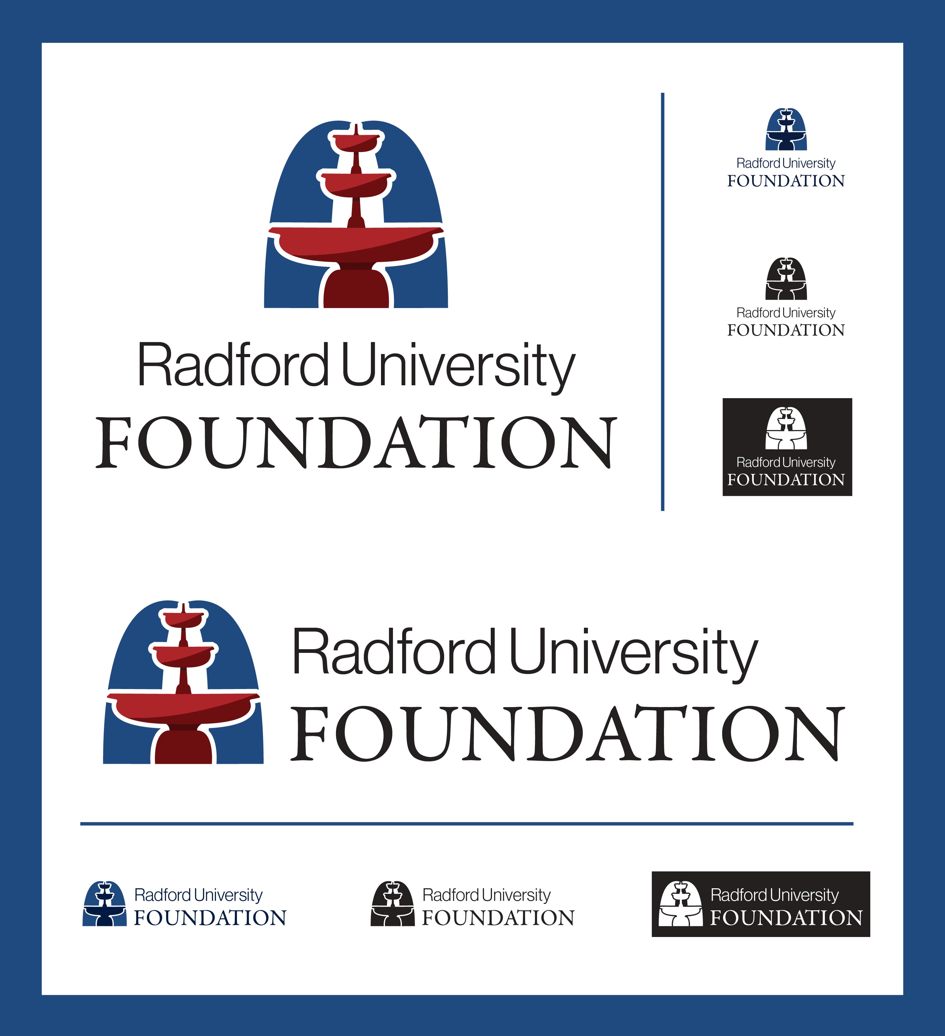
Logo option 3: This logo uses a simplified version of the fountain on Radford University’s campus. For those familiar with Radford, it creates a clear connection to the school, while still working as a standalone symbol for the Foundation. The style of the icon is clean and modern, but the fountain itself suggests consistency and reliability.
The red and blue color palette ties the Foundation directly to the University while still helping it stand on its own. These colors feel familiar but also give the logo a more updated look.
The typography follows a similar approach. “Radford University” is set in a clean sans serif to give it a more current feel, while “Foundation” uses a serif typeface to suggest trust and stability. Together, they balance a sense of tradition with a more modern direction.
Final Branding:
Final Logos:
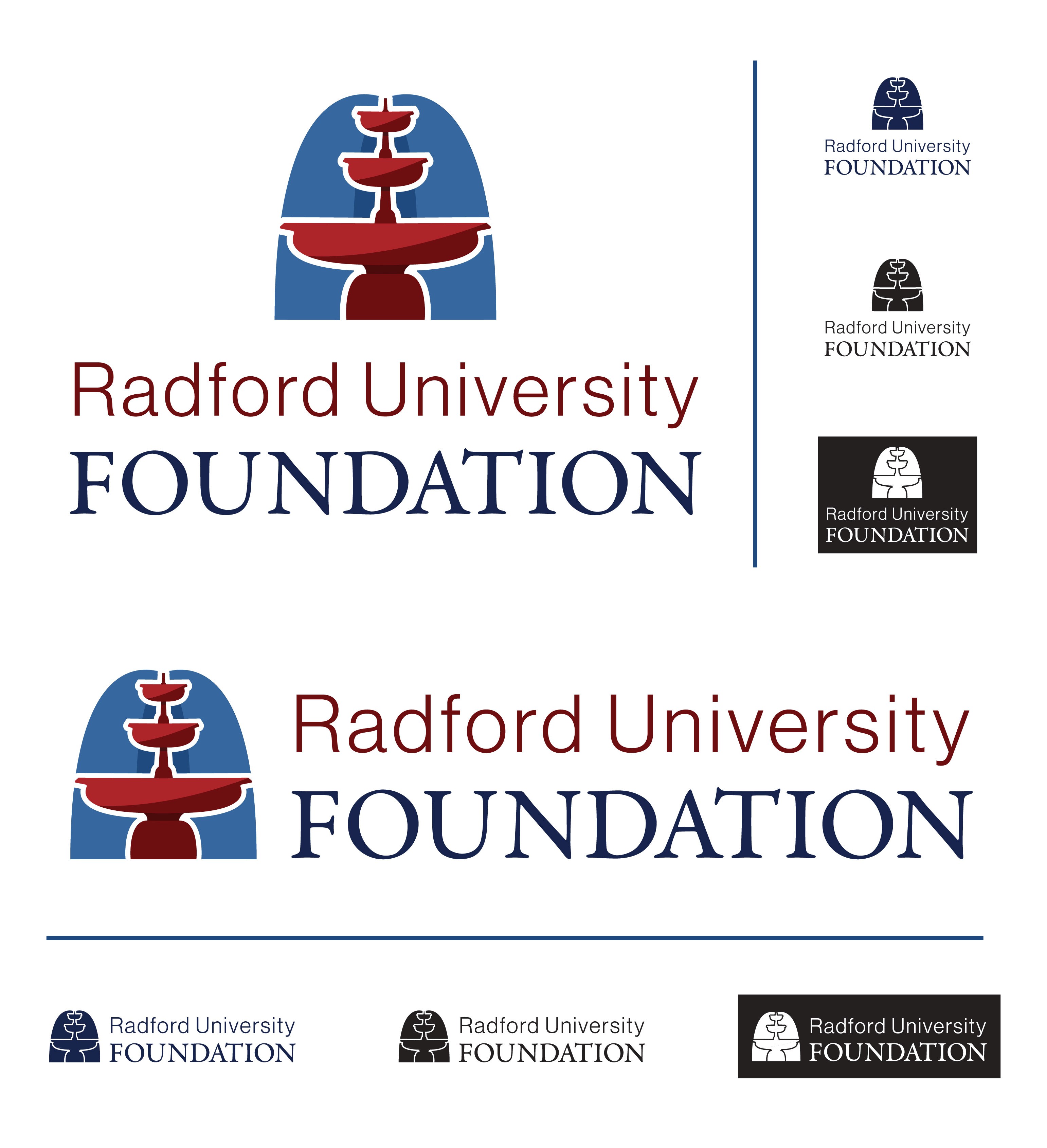
The third logo option was chosen. Tweaks included adding another blue shape behind the main water of the fountain to fill in the white space in the original logo. The type was also changed to match the colors of the fountain and the kerning and spacing of the type was adjusted.
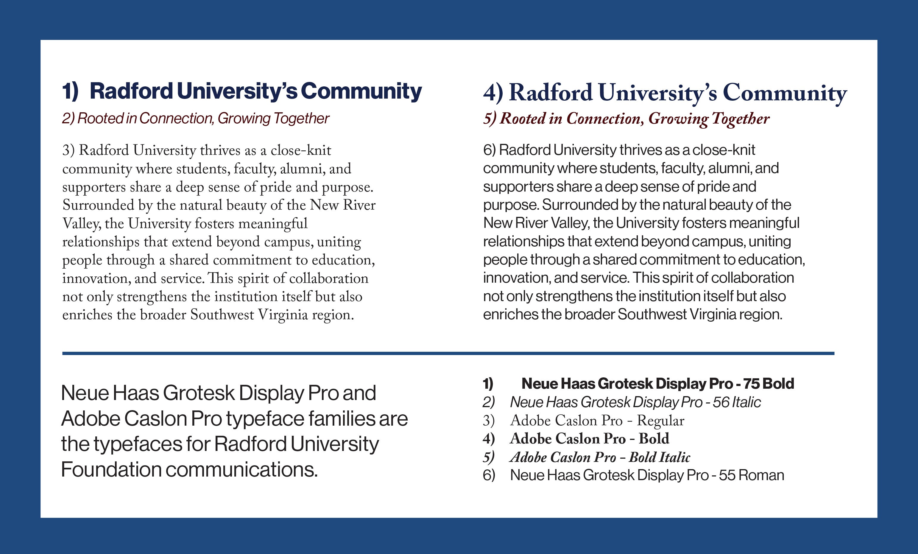
Corporate Typefaces:
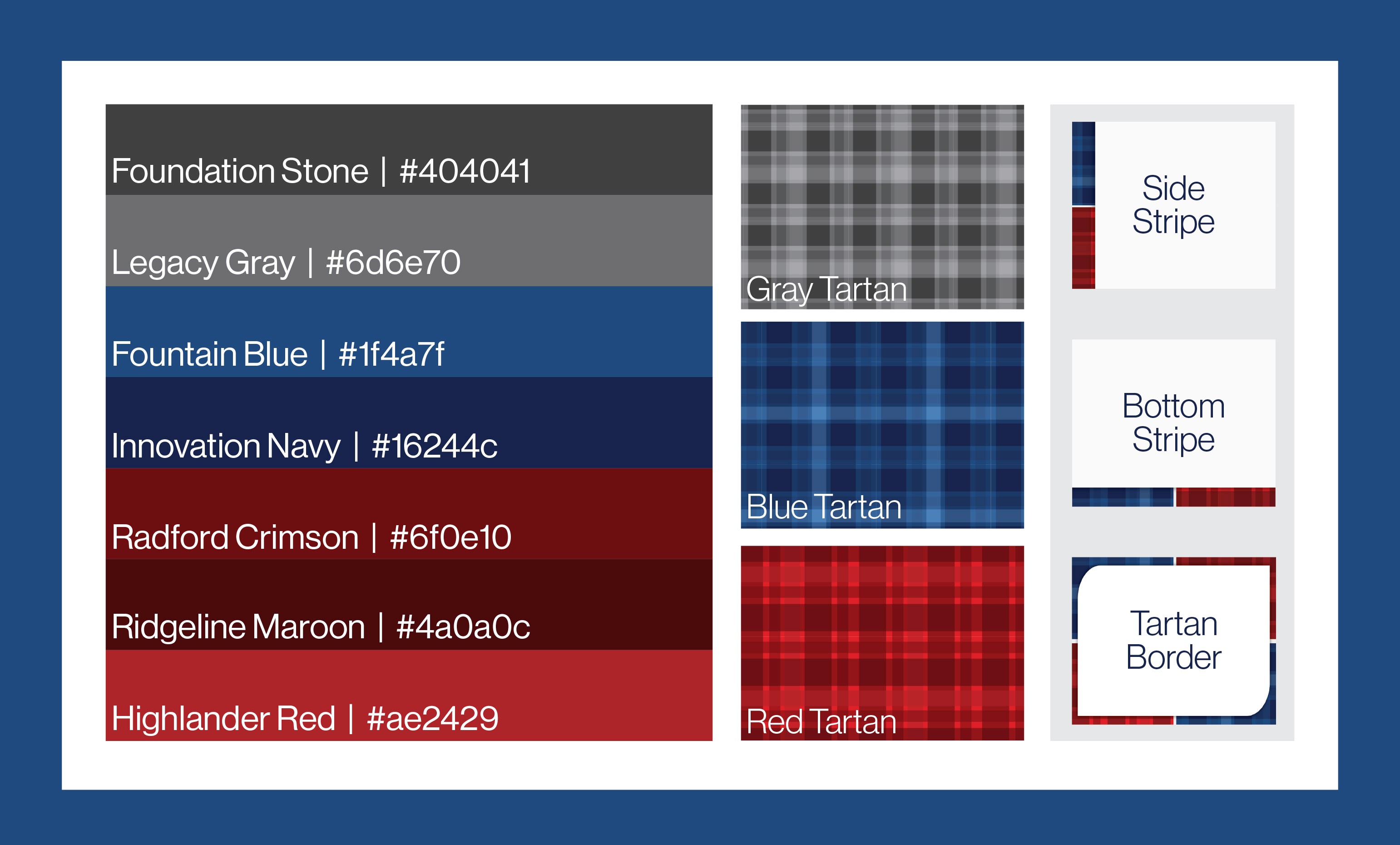
Corporate Colors, Patterns, and Graphic Elements:
Stationery Suite: