Advertising Campaign
Brand Development
Award Winning
Case Study
I developed a refreshed brand identity for U-Totem, including a new logo, visual system, stationery, and a comprehensive logo and branding framework. The project also featured a multi-platform ad campaign and a set of fold-out brochures with regional road trip maps highlighting tourist destinations and store locations, positioning U-Totem as an ideal stop when you’re on the road.
Branding Creative Brief:
Logo Redesign Proposal for U-Totem
Overview:
U-Totem is a reimagined convenience store chain aiming to become a leading player in the mid-Atlantic region by offering a fresh, modern, and high-quality experience. Strategically located near interstate exits, U-Totem stores cater to auto travelers with a focus on convenience, quality, and customer satisfaction. The logo redesign is central to establishing the brand as a distinctive and appealing destination for coffee, snacks, and unique offerings like a growler bar for local craft beer.
Project Objectives:
The primary goal is to create a logo that:
Reflects U-Totem’s modern and innovative approach.
Appeals to young, discerning travelers while maintaining broad accessibility.
Differentiates the brand from established competitors like Wawa and Sheetz.
Brand Identity:
Essence: Modern, welcoming, and convenient.
Mission: To provide a high-quality, traveler-focused experience that blends practicality with unique offerings.
Values: Quality, cleanliness, and customer service.
Design Direction: The logo should incorporate the name “U-Totem” and may include a subtle nod to the concept of “toting” or carrying items. If including a totem-related visual, ensure it avoids cultural insensitivity and appeals broadly.
Target Audience:
The primary audience includes:
Young adult travelers (millennials and hipsters).
Families and individuals seeking a quick, quality stop during road trips.
Local communities in underserved areas near interstate exits.
Competitive Landscape:
U-Totem competes with convenience giants like Wawa and Sheetz. These brands rely on bold, recognizable designs that emphasize accessibility. U-Totem should create a distinctive, innovative logo that emphasizes its unique features, such as its growler bar and premium coffee and donuts.
Design Considerations:
Versatility: The logo must work well across multiple applications, including signage, packaging, uniforms, and branded products.
Modern Appeal: Avoid traditional convenience store aesthetics while ensuring the design is professional and inviting.
Scalability: The logo should be clear and impactful, even at smaller sizes.
Brand-Friendly Colors: The color palette should evoke quality, freshness, and modernity while distinguishing U-Totem from competitors.
Key Message:
The logo should communicate that U-Totem is a fresh, modern, and convenient destination for travelers, offering a high-quality experience that makes it a pleasure to stop by.
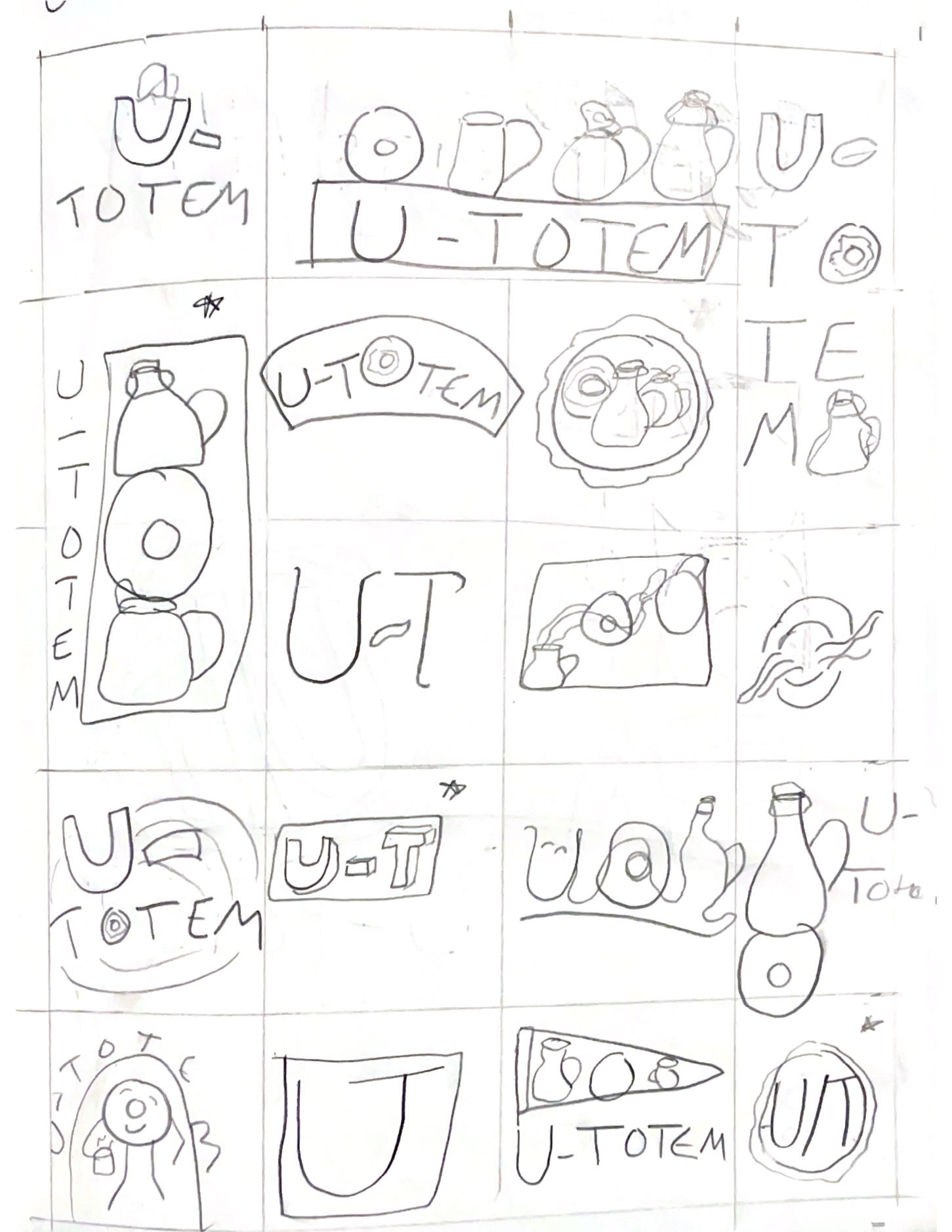
Sketches & Initial Work:
Logo Sketches:
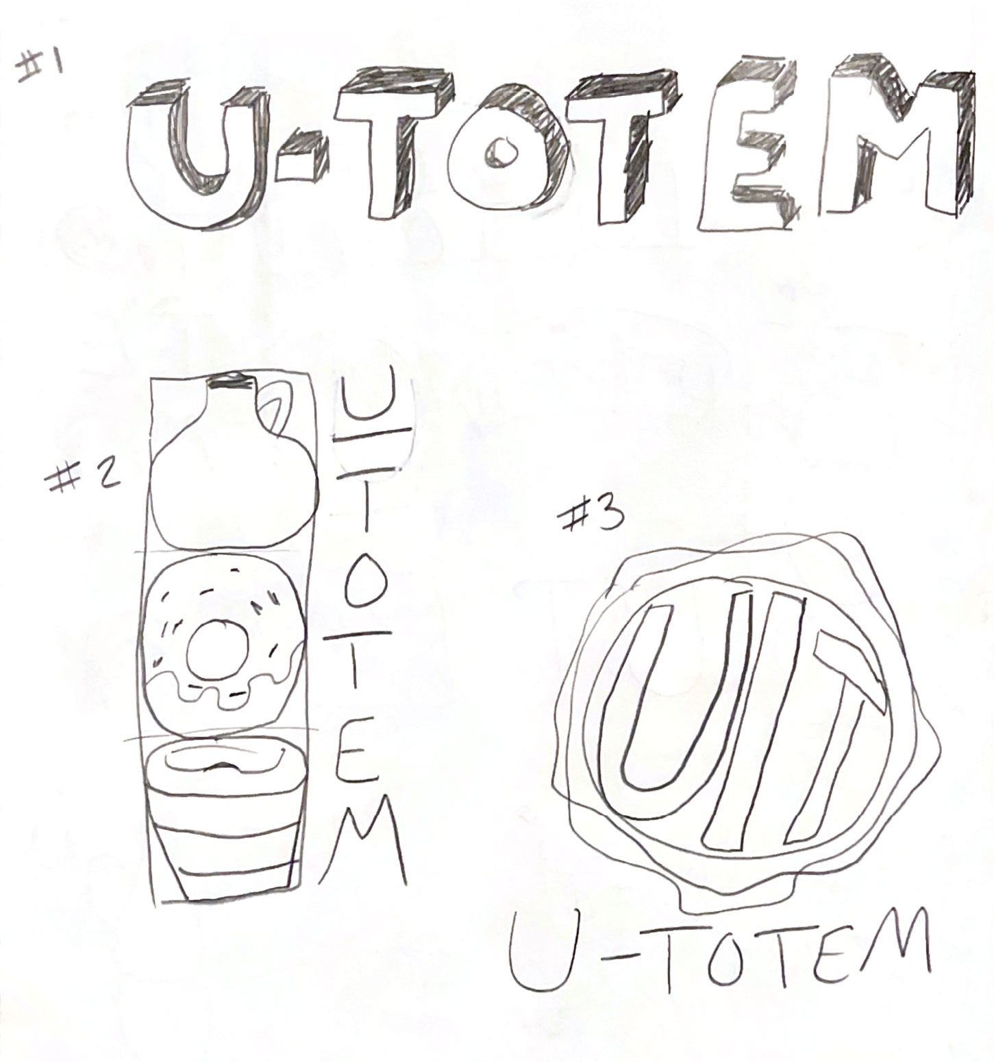
Logo Pencil Roughs:
Logo Digital Roughs:
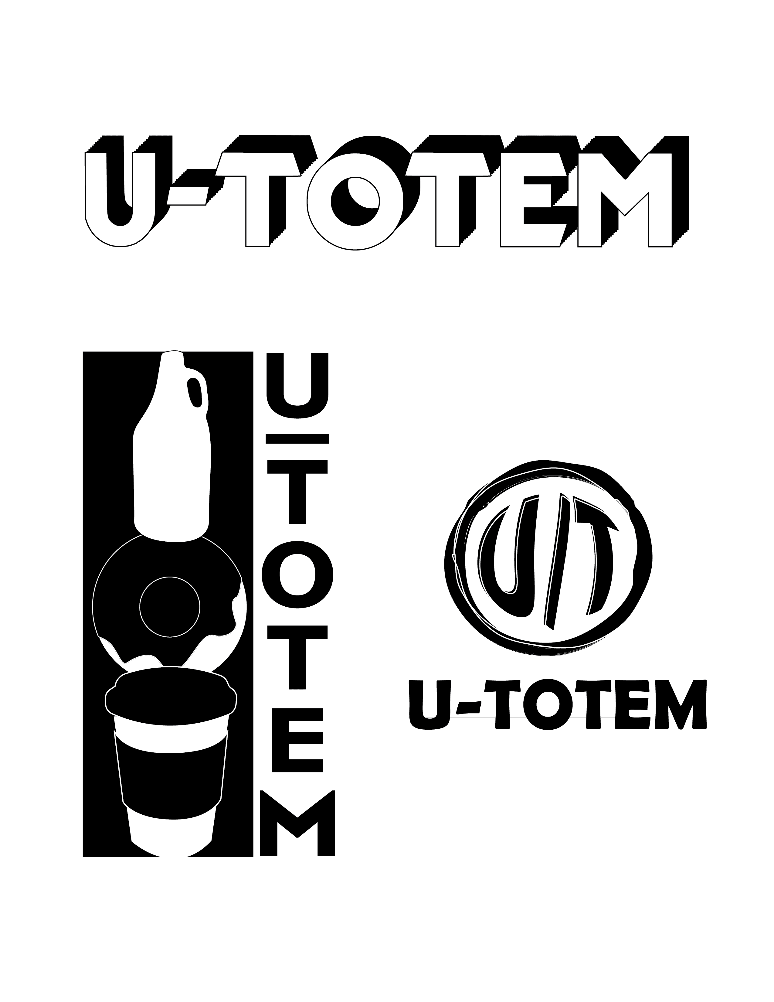
Logo Options Presented:
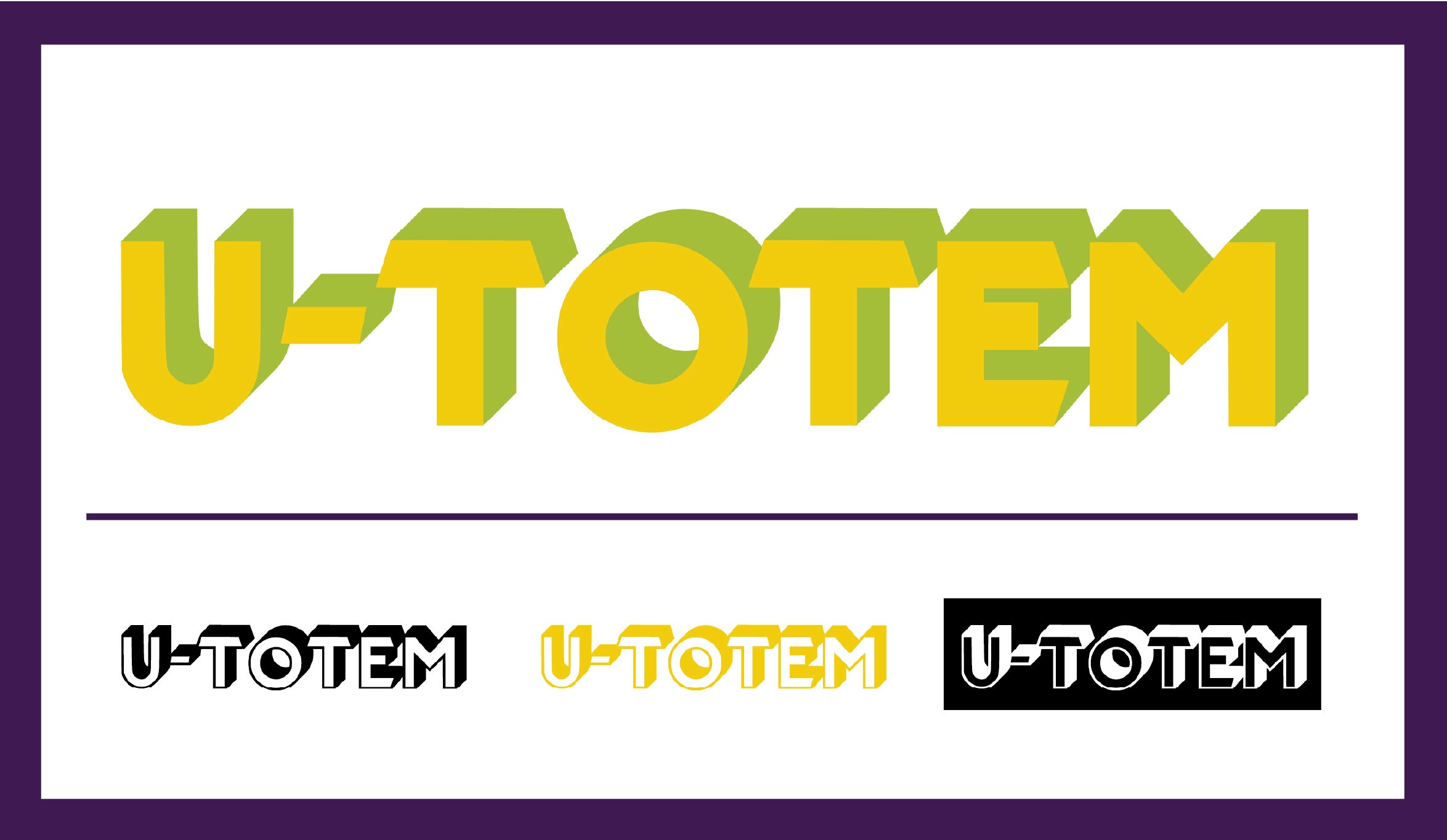
Logo option 1: This logo was designed to appeal to the younger generation of shoppers and travelers. The logo evokes a friendly, reliable feels that will welcome shoppers. The typeface and 3D affect were chosen to appeal to a younger, more hip demographic of shopper, while also distinguishing itself from other convenience stores such as Wawa or Sheetz. The color yellow was chosen because it is an eye catching, friendly color that can appeal to ages young and old alike. The color green was chosen to represent U-Totem’s fresh selection that shoppers can expect inside.
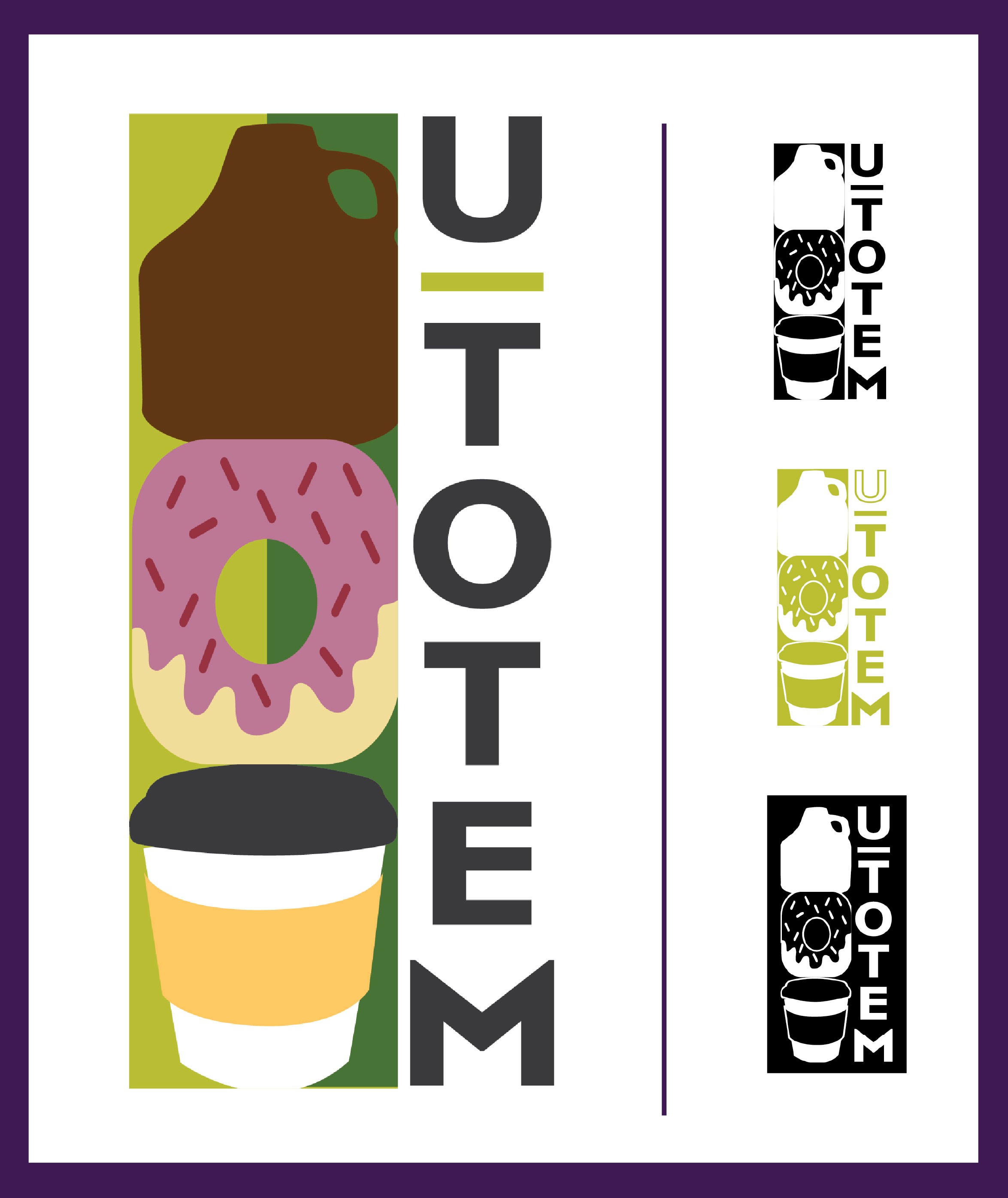
Logo option 2: This logo shows off what one can expect when you shop at an U-Totem. The logo icon features a to-go coffee cup, a donut, and a growler in a shape that’s reminiscent of a totem pole. The two toned green background was chosen to represent the freshness that U-Totem offers to their shoppers. The typeface was chosen for its clean, upscale feel, and was turned upwards to mimic the shape of the main logo icon. Using these visuals clearly differentiates U-Totem from it’s competitors while indicating to shoppers that they have fresh, unique offerings.
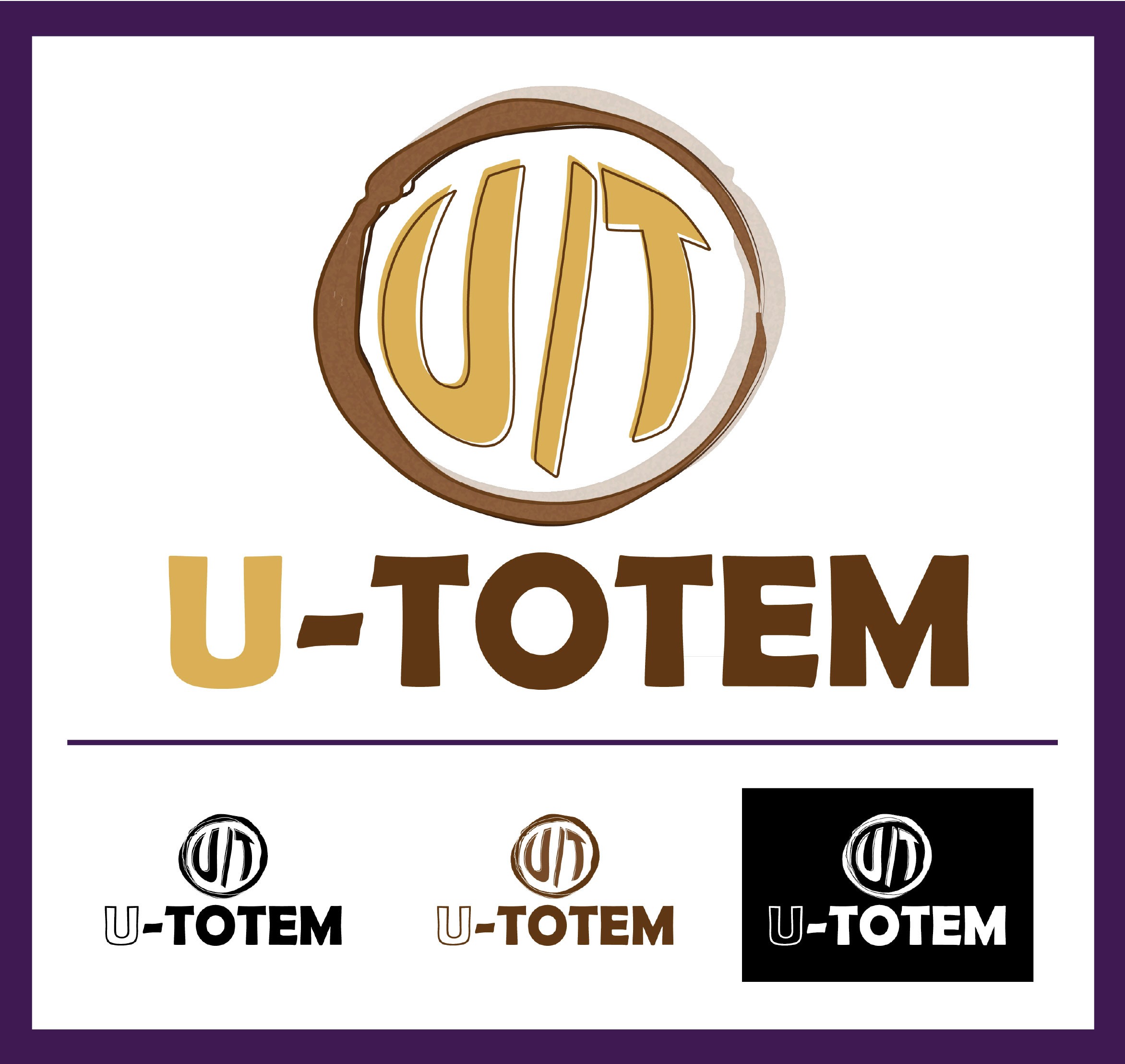
Logo option 3: This logo’s main icon turns the ‘U-T’ in ‘U-Totem’ into ‘U/T’ surrounded by coffee rings. The reason for this change is to bring a fresh feel to the convenience store industry with this rebranding, and to appeal to the youngest generation of shoppers and travelers. The colors were chosen to give the brand a welcoming, cozy feel that will draw travelers in and make them feel like their visiting their favorite coffee shop from home. The typeface was chosen for it’s imperfect, friendly, welcoming feel that the audience will appreciate.
Final Branding:
Final Logo:
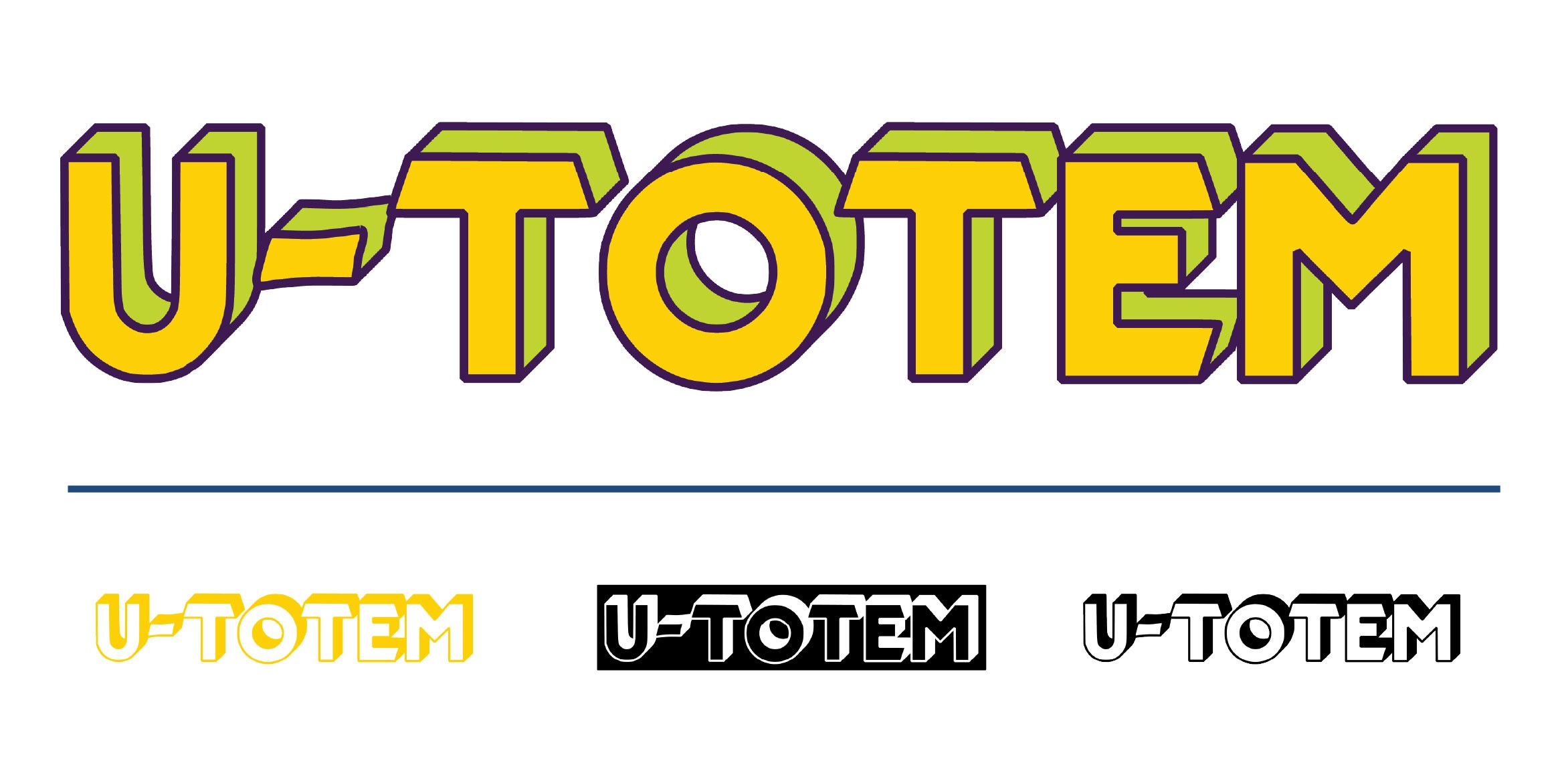
The first logo option was chosen to continue forward with. A purple outline was added about the letters to help with legibility.
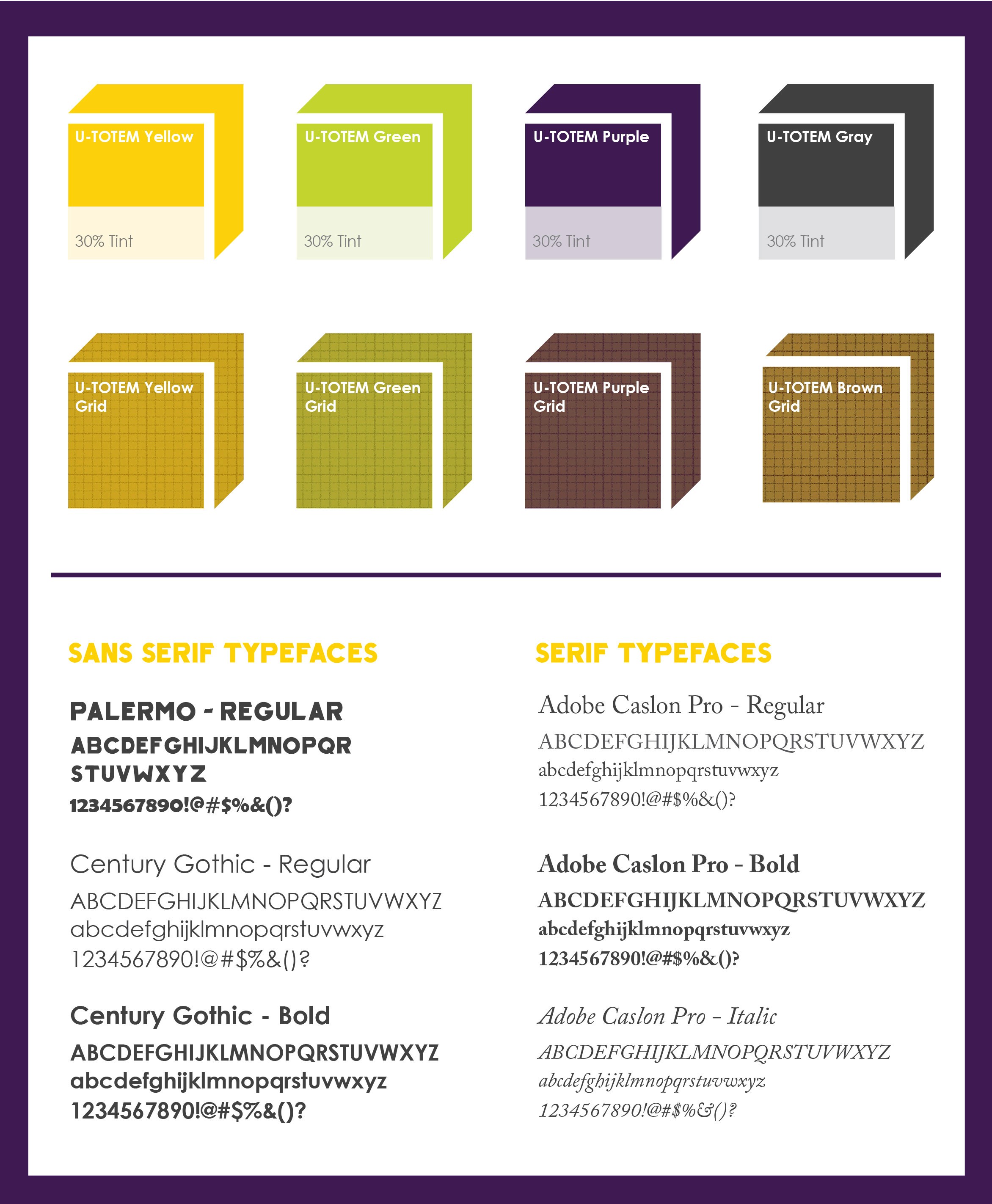
Corporate Typefaces, Colors, Patterns:
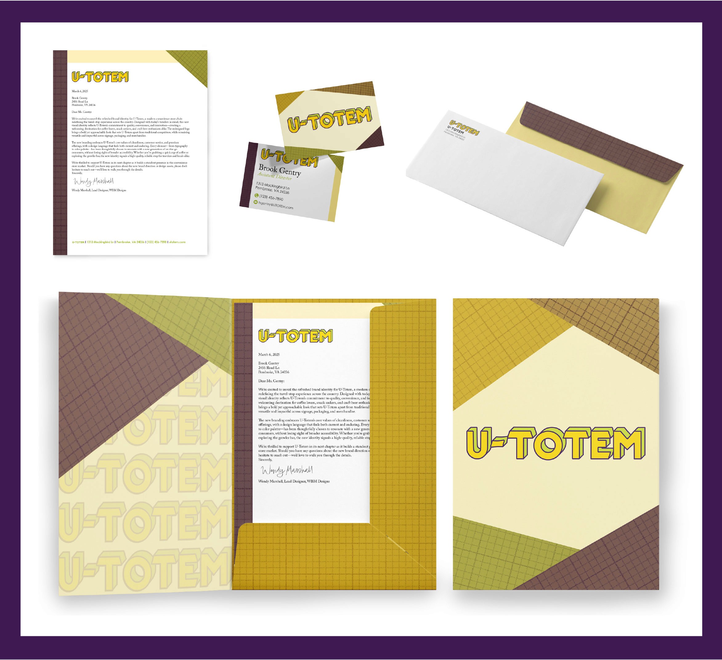
Stationery Suite:
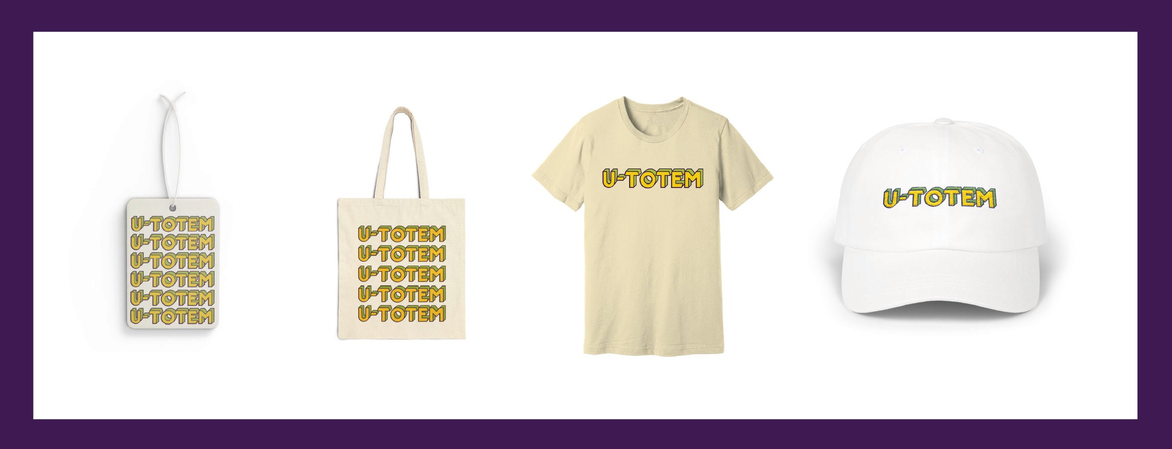
Specialty Application:
Advertisement Campaign Creative Brief:
U-Totem Advertising Campaign
Overview:
U-Totem is a modern convenience store designed for travelers, offering a higher-quality and more enjoyable stop along the road. This campaign focuses on positioning U-Totem as more than just a gas station—highlighting it as a reliable, well-designed place to stop, recharge, and continue the journey.
Objective:
Create a cohesive advertising campaign that introduces U-Totem as a go-to road trip stop and sets it apart from traditional convenience store chains. The campaign should communicate quality, ease, and consistency across multiple touchpoints.
Concept:
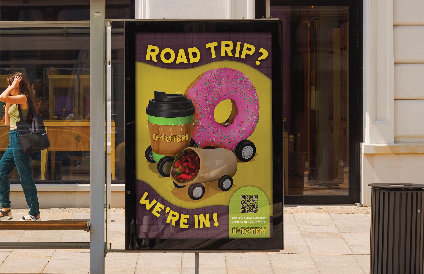
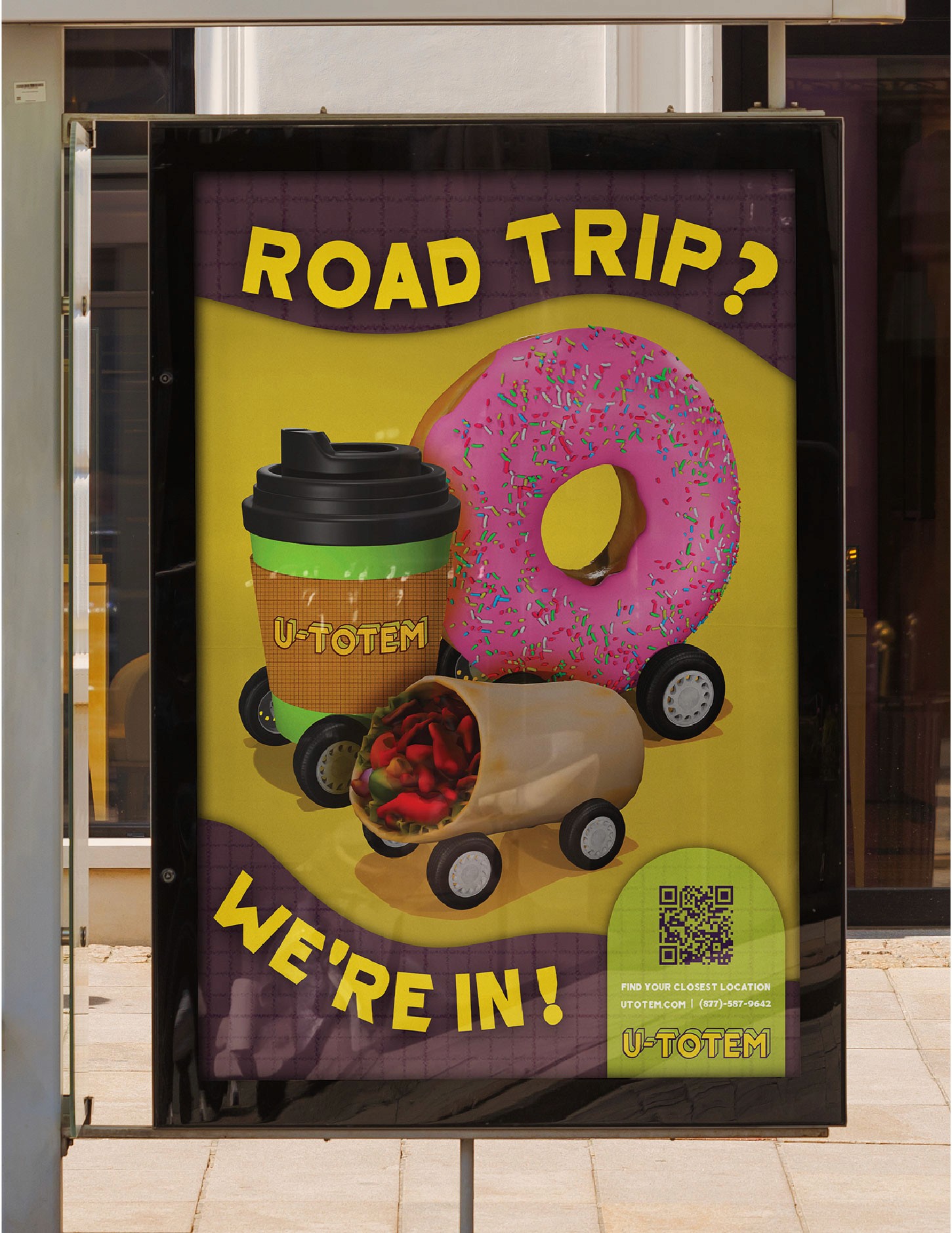
The campaign centers around the idea of the road trip, framing U-Totem as a natural and worthwhile stop along the way. Each piece highlights different moments of travel while reinforcing the brand as a dependable and appealing destination.
Target Audience:
Young adult travelers
Families and individuals on road trips
Drivers looking for a reliable, higher-quality stop near interstate exits
Key Message:
U-Totem is a convenient, modern stop that makes road trips better.
Deliverables:
Three print advertisements
One billboard and one bus stop advertisement
One online banner ad
Three brochures featuring fold-out road trip maps
Design Approach:
The campaign uses a consistent visual system built from the U-Totem brand identity, with a focus on bold, clear layouts and imagery that captures the experience of travel. Each piece is designed to work both individually and as part of a larger system, maintaining consistency across print and digital formats.
Final Campaign:
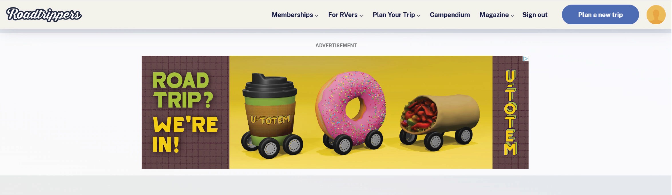
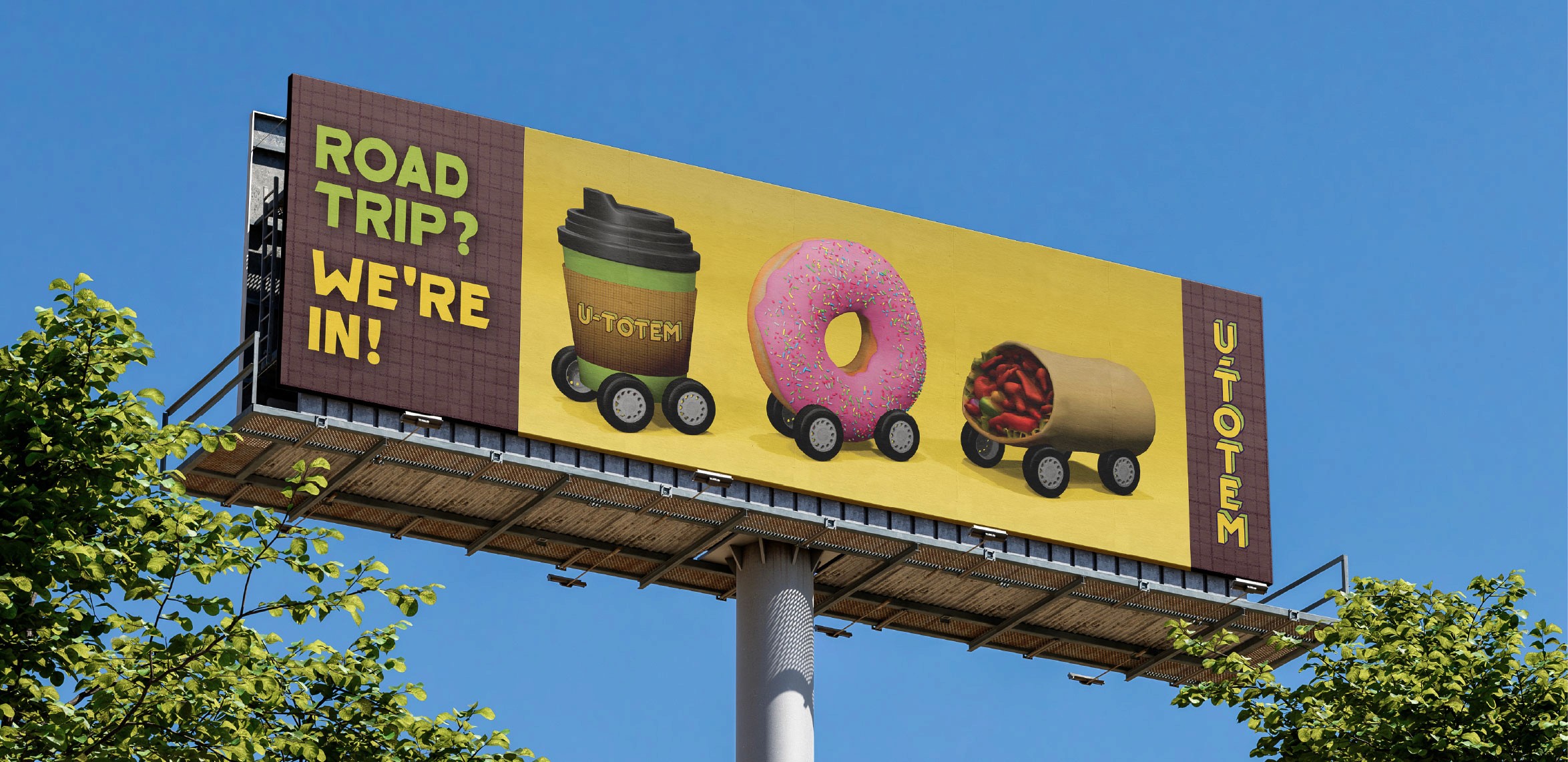
Billboard and Online Ad:
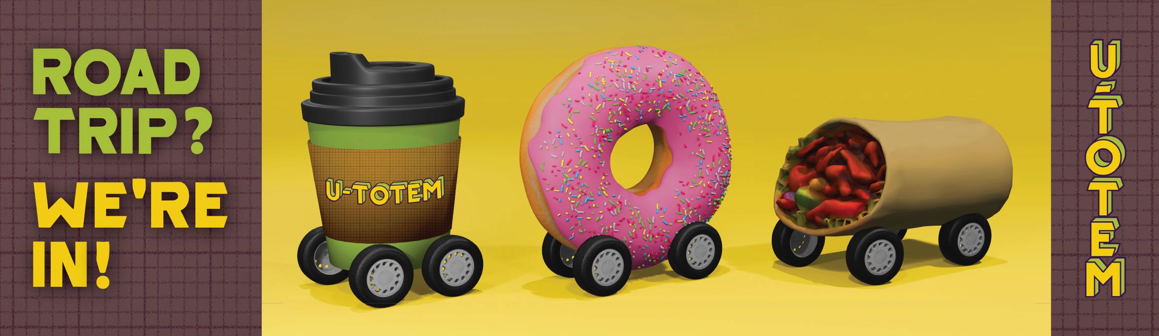
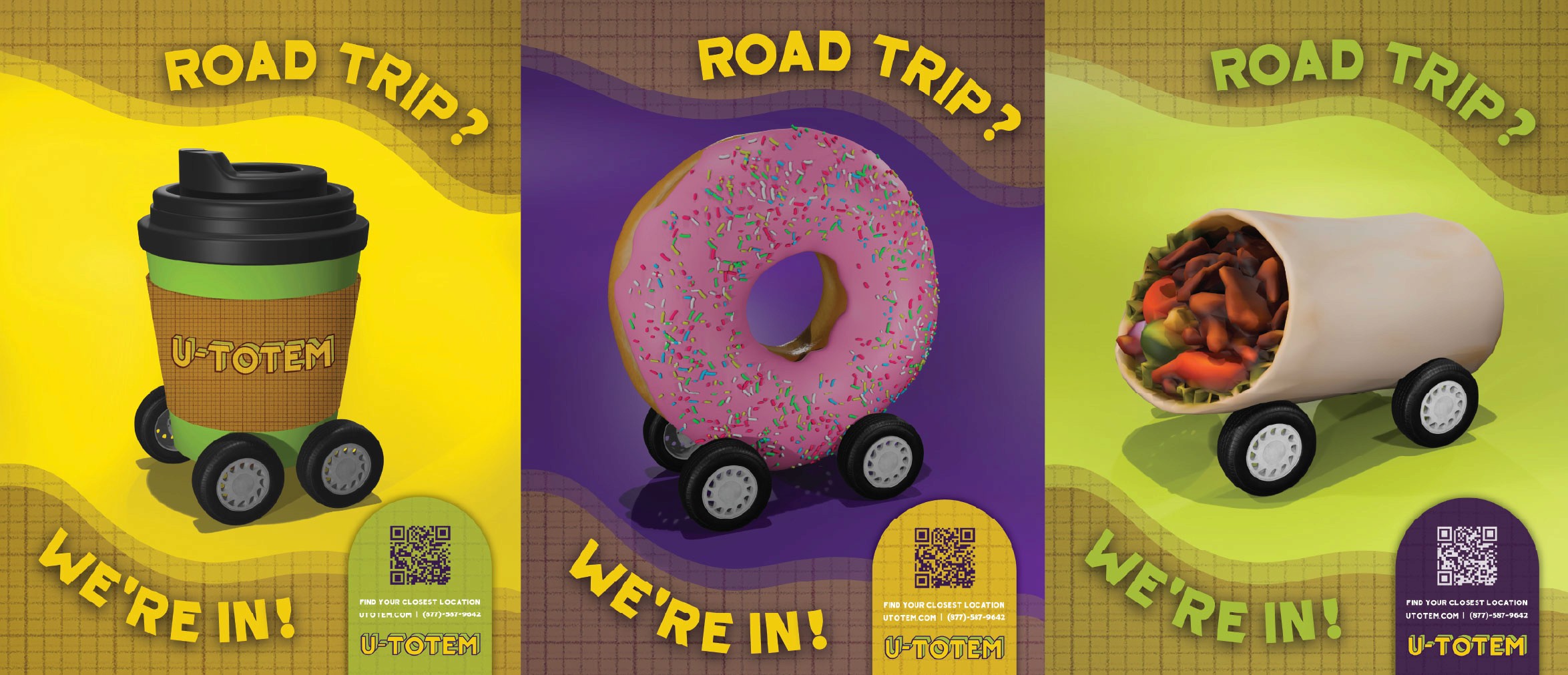
Magazine Ads:
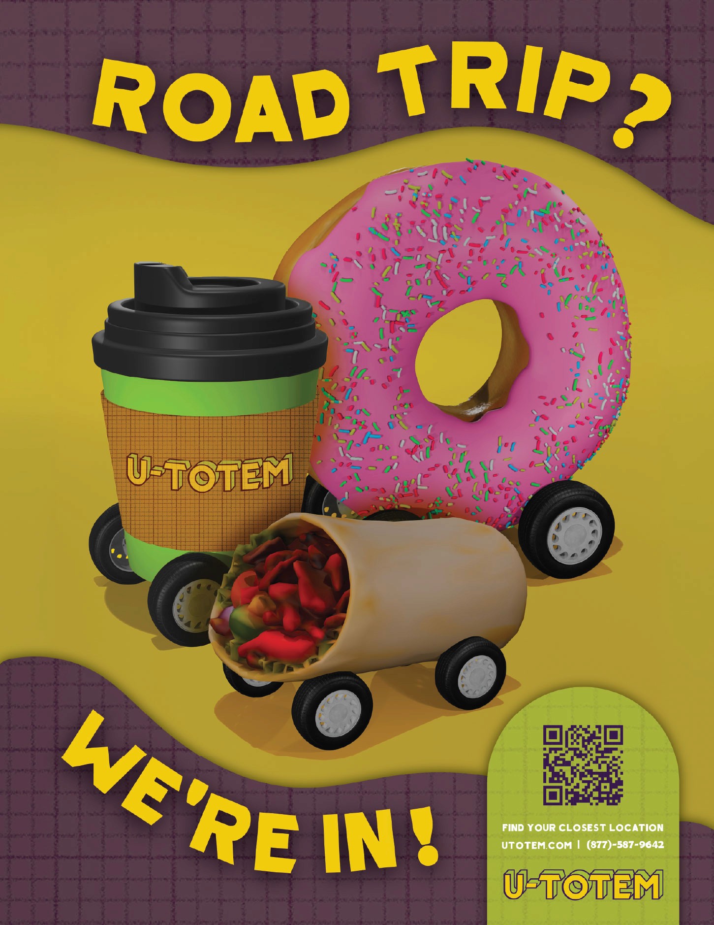
Bus Stop Ad:
Brochure Campaign:
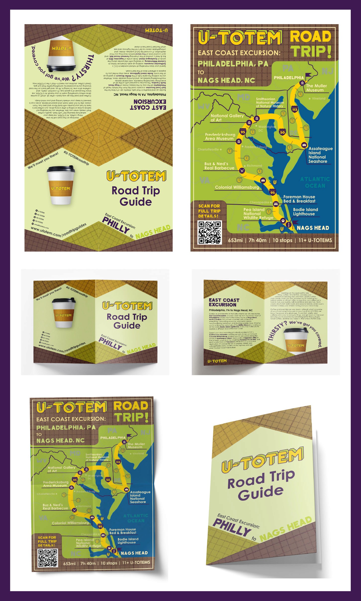
Brochure showing a map of an East Coast road trip.
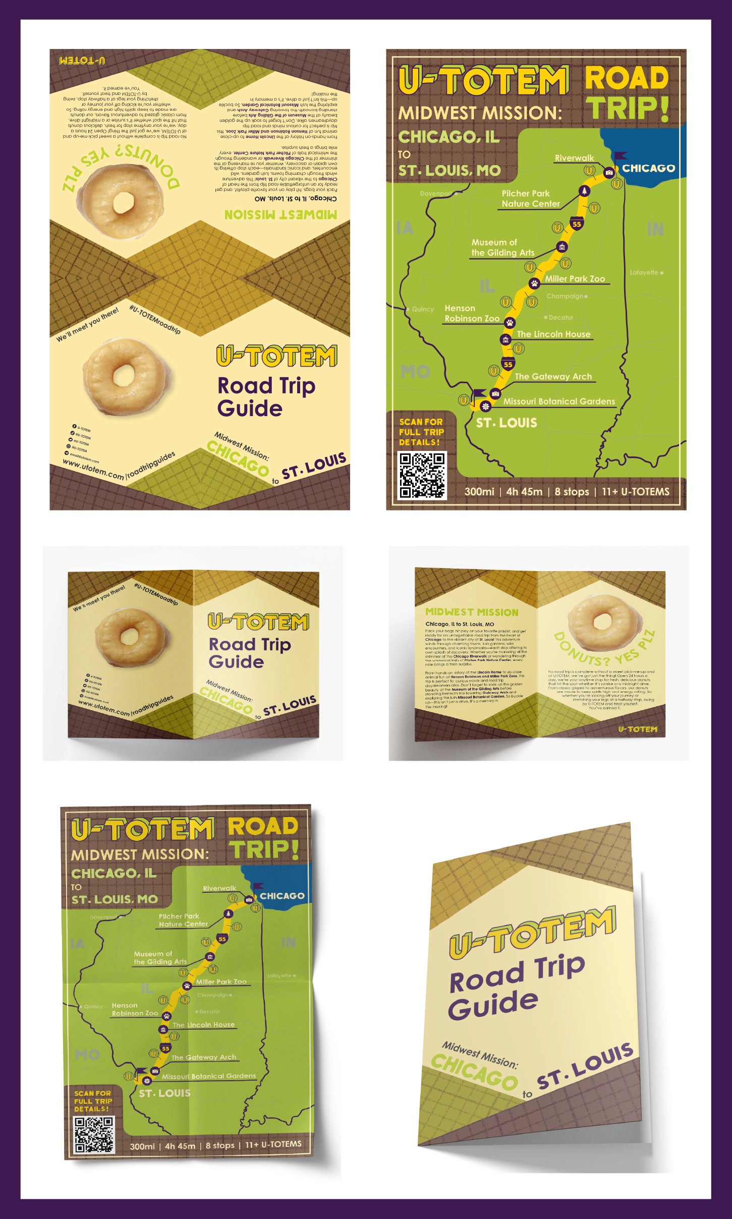
Brochure showing a map of a Midwest road trip.
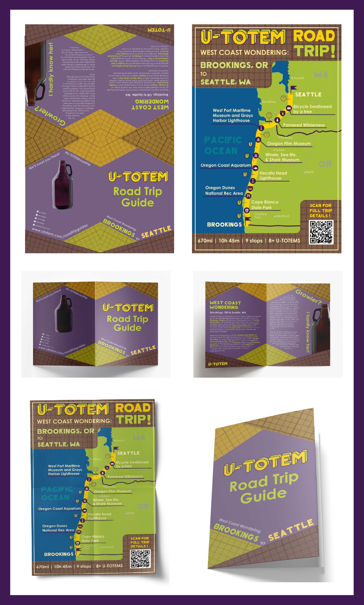
Brochure showing a map of a West Coast road trip.