Packaging Design
Brand Development
Illustration
Award Winning
Case Study
I redesigned the logo and developed a complete packaging system for Kilt Guilt Scottish Ale by Backyard Brewing, including the can design and multi-pack container. The project focused on production-ready packaging, visual impact on crowded retail shelves, and cohesive branding that communicates a small-batch feel while supporting national distribution.
Inspiration & Sketches
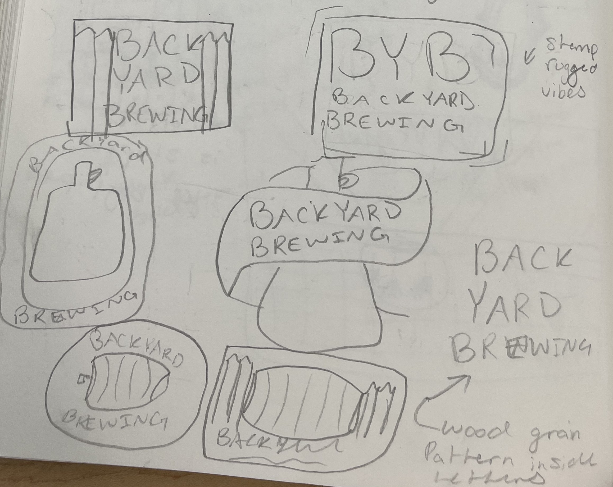
Backyard Brewing logo sketches:
Packaging Sketches and Mood Boards:
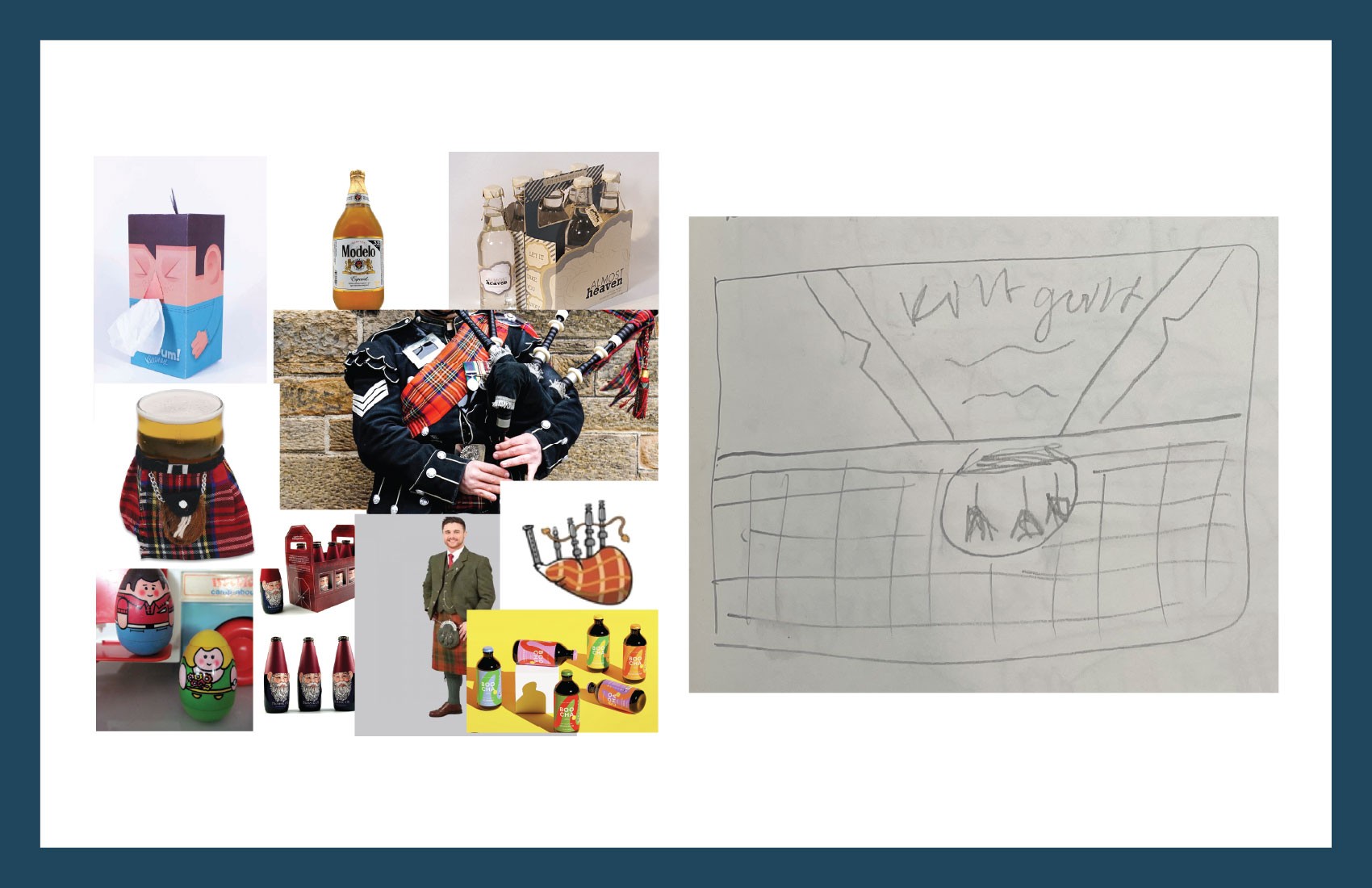
My first concept for the packaging design of Kilt Guilt Scottish Ale was to create characters from the beer bottles.
This design would lean heavily on the "Kilt" of Kilt Guilt. My plan was to make the bottle label designs be directly modelled after a traditional Scottish outfit and to create a bagpipe shape for the bottle carrier.
This design would be playful, vibrant, and a little over the top.
The goal of this design would be to stand out from the competition in a playful but bold way that communicates to a shopper that Backyard Brewing is a little company with a lot of character.
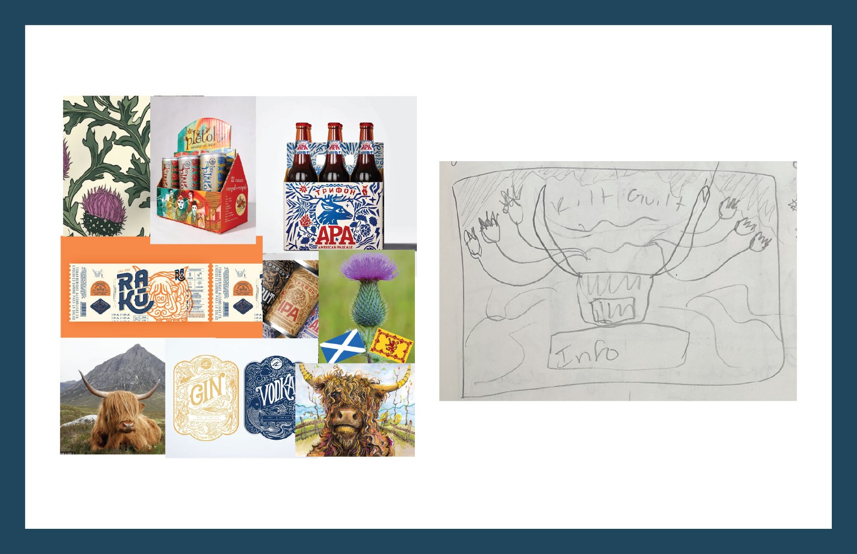
For my second design concept, I wanted to lean into a more nature inspired design. My plan would be for a large highland cow to make up most of the visual design with thistles swirling about the cow and filling up the label. Throughout this artwork the images would create pockets of space for the necessary labeling information and government warnings to be placed.
The art style of design would border between whimsical drawings and a more rigid wood cut structure, hopefully standing out from the rest of the beer aisle.
The goal of this design would be to stand out from the established art styles of either bold and somewhat intimidating art of some packaged beer (monsters, skulls, etc) and the traditional type only style of others. This design would occupy the middle of that spectrum and would be a softer design style that references nature found throughout Scotland.
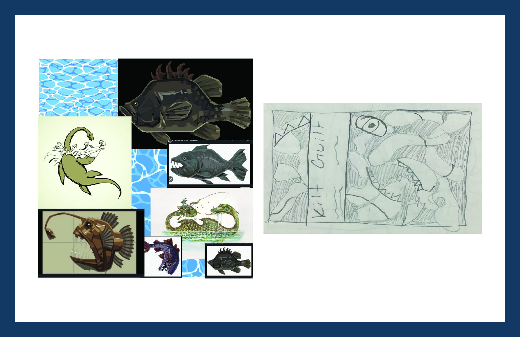
For my third design concept, I wanted to lean into the boldness that is currently dominating the beer aisle. To do this, I wanted to depict the Loch Ness Monster, Nessie, going after a fish, but you're seeing this scene play out through the water.
To do this, I wanted to create a top label that contains all of packaging type needed on flat water background. The top label would have physical have cuts outs that would show a larger scene underneath. When the user peels the top layer of the design off, they see the whole picture of this scary monster going after a fish.
I was heavily inspired by the visuals and moody themes of a fishing game called Dredge, a few examples of the fish above. I wanted this design to feel bold and 'wicked".
Print Files and Process:
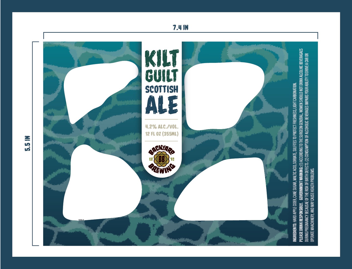
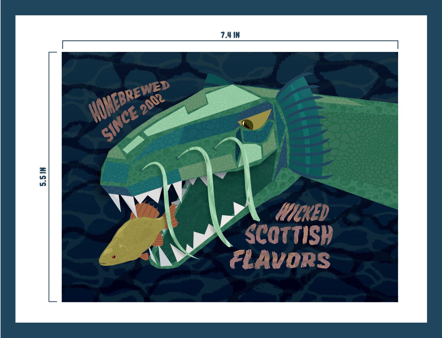
The Design:
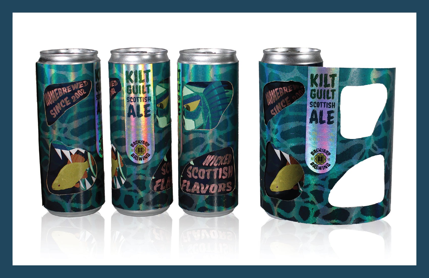
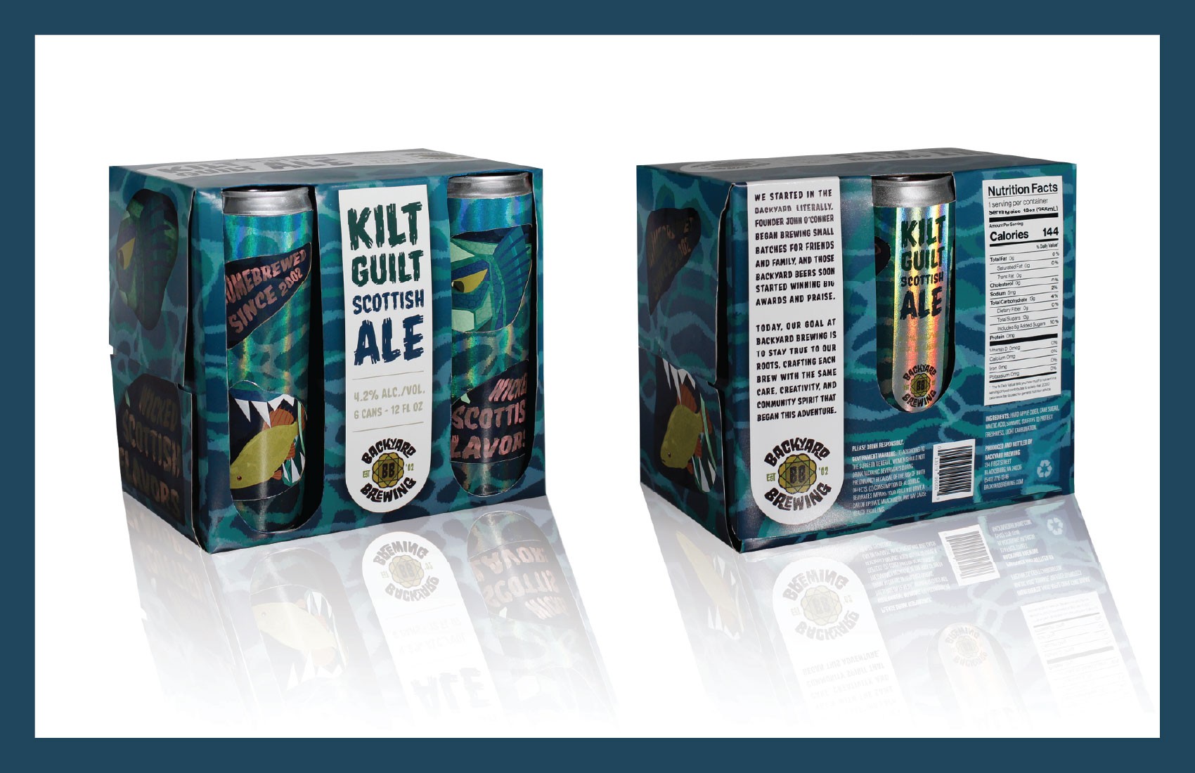
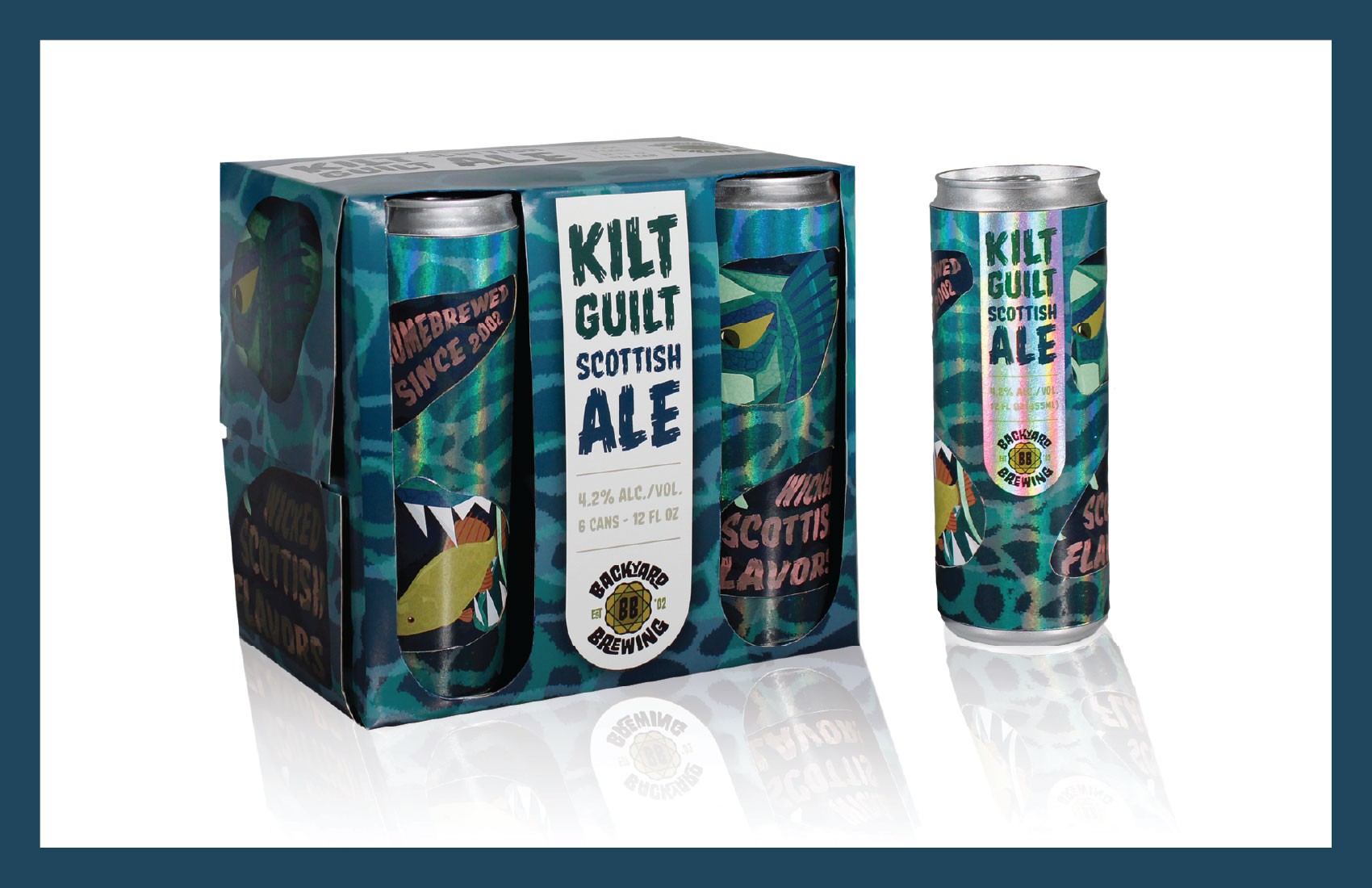
I decided to go with the underwater Nessie design for this rebrand. The goal of this design was to be bold and create an unexpected element for the users by adding a peelable top label to reveal a large piece of artwork underneath. The overall goal I had going into this design was to create visuals that would be eye-catching to pull people in and to cerate a unique experience people would want to share with others.
The design process for this project started with deciding the best way to layout the top label and all of the necessary information. I went through many iterations of this design, tweaking how all of the elements would work together and how to create two completely different layouts that worked well on their own, but also meshed well when you layered them on top of each other to create a third composition.
After I had the general layout I wanted under control, I moved onto the artwork for the pieces, paying close attention to the colors and textures used.
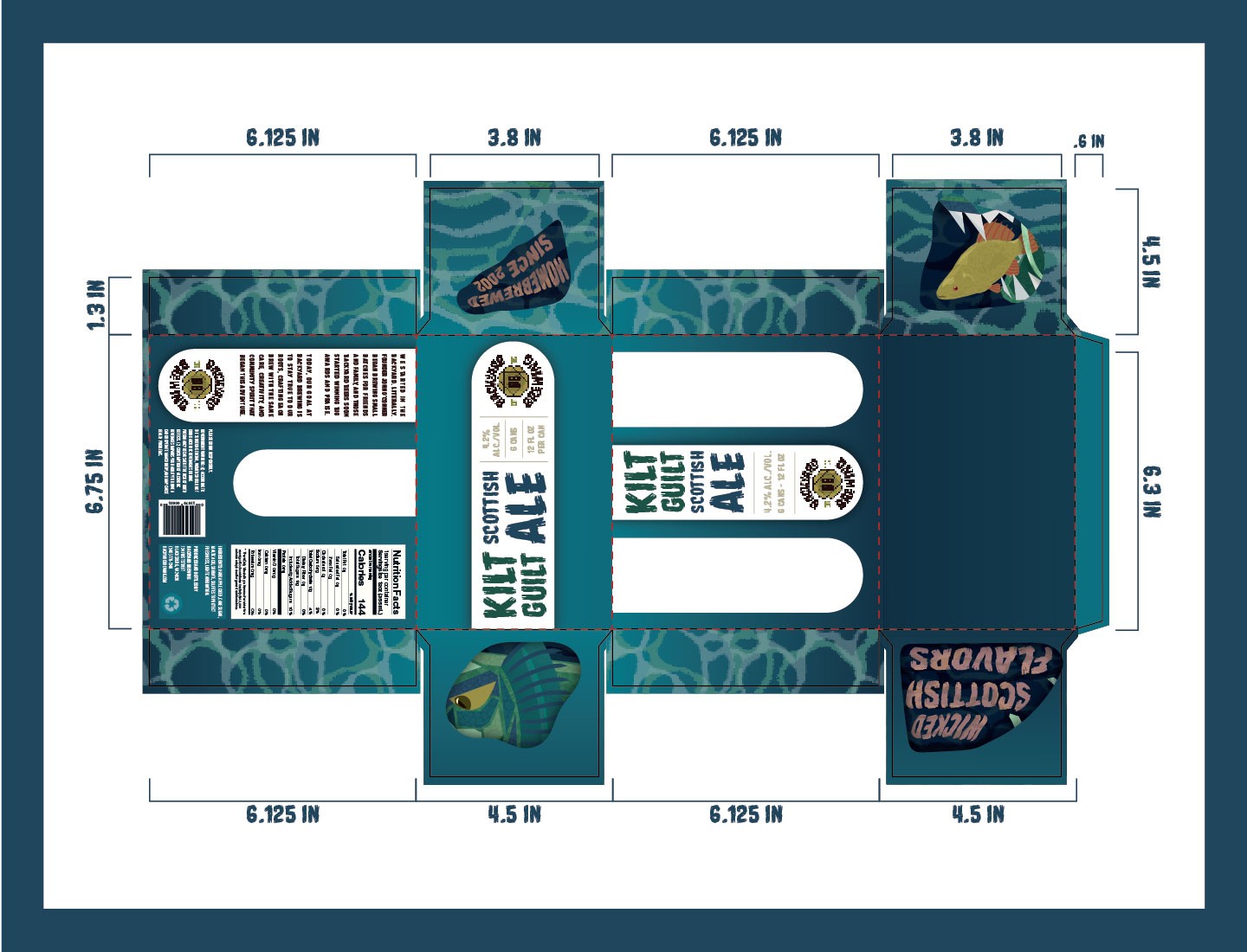
After I had the designs for the cans squared away I turned my attention to the box. Our challenge with the box was to create a piece that went with our cans, but wasn't a direct copy of the can's design.
For the box, I stuck with the outside label's water pattern and also used the banner shape heavily. I wanted to create a unique experience for the box like I did with the cans, so I cut out holes in the banner shapes so the cans would be poking out and would continue the overall design with how they are turned in the box.
The Materials:
After the ideation stage of this project and when I decided to make two separate labels, I turned my attention to deciding what materials to use.
I originally was planning on making the top label out of glossy paper and the bottom label out of matte paper, to give the layers different feels and visuals. The only problem I had with this idea was I wasn't in love with the idea of using a matte paper since I felt like the artwork of Nessie wouldn't pop and be as striking as I wanted.
I then decided to try out a bunch of papers with metallic or holographic finishes for the top label, so I could use a glossy paper for the bottom label.
I decided on a paper with a holographic finish for the top label. Not only did this option let me use a glossy paper for the bottom label, but it also added to my overall goal of creating a design that's initially eye-catching and then a little unexpected.
The Outcome:
The outcome of the final design accomplishes my goal of creating packaging that is eye-catching to pull customers in and has unexpected qualities that would have them show others.
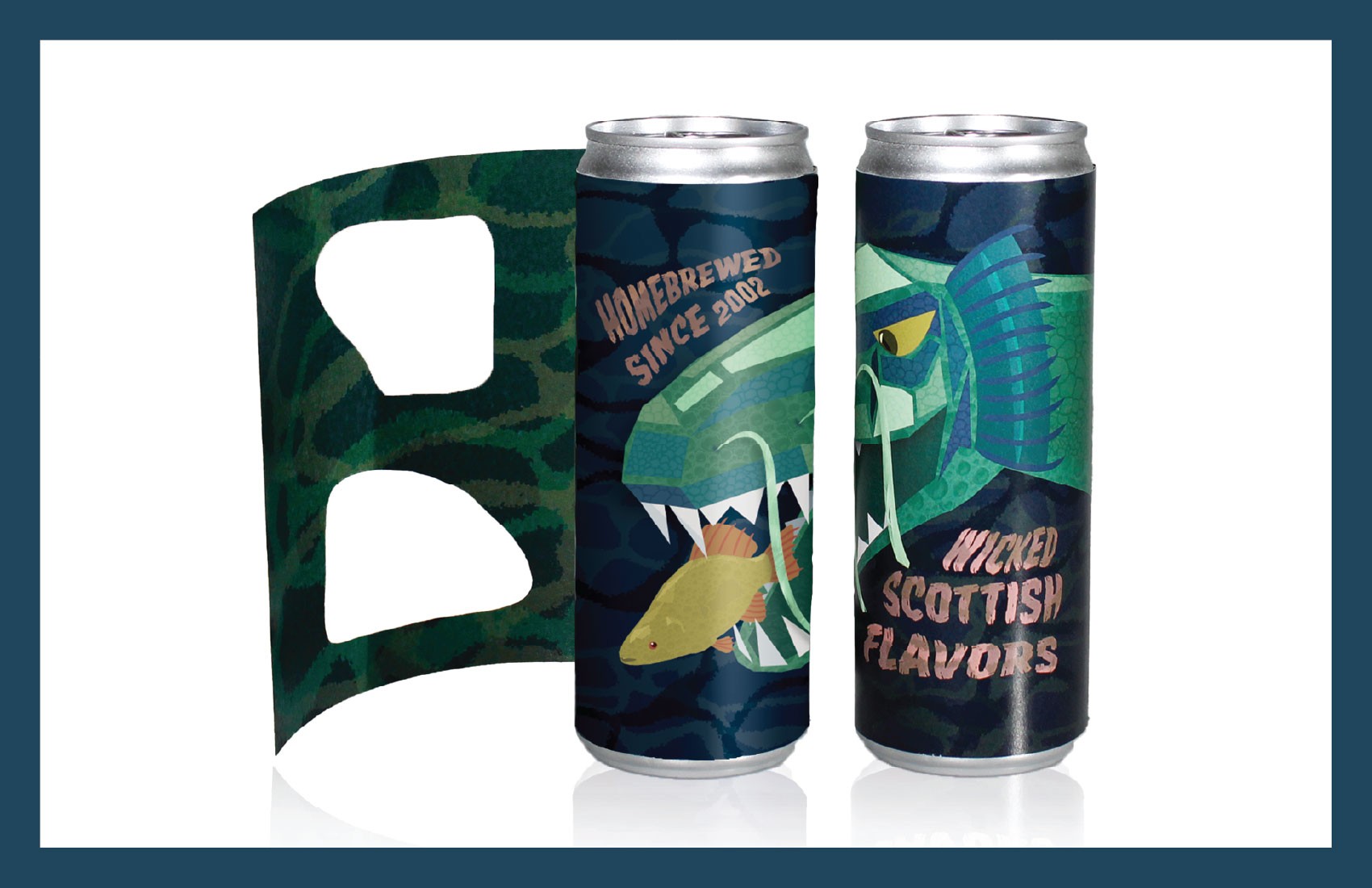
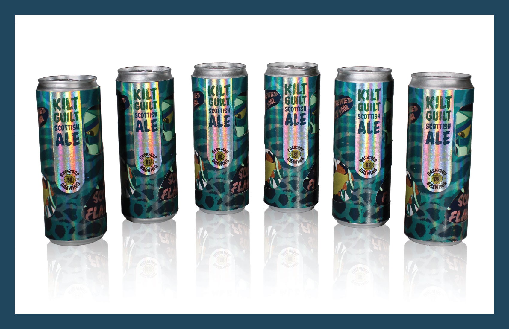
For my can designs, I have two labels with the idea of the top label being able to be peeled away. The top label has all of the necessary labeling information and government warnings. The top label also has cut outs so the user can see the bottom label below. Once the top label is peeled back the user can see artwork span the entire can of the Loch Ness monster chasing a fish with words promoting the product warped around the scene.
The two labels play together to create three different compositions, depending on how the user is viewing the product.
I also used two different types of paper for the labels. The top label is printed on a holographic paper. This gives the main banner label a very shiny, eye-catching quality and makes the water design shimmer in certain lights. In contrast, the bottom label is printed on glossy paper, making sure the artwork is bold and vibrant.
Finally, the box was designed with the can's design in mind. I used the same water designs for all sides of the box and created cut outs, in the shape of the main label banner, that were almost the same size of the cans. From these cut outs, you can position the cans inside so that you are continuing the same monster peaking through the water design that's on the cans themselves.
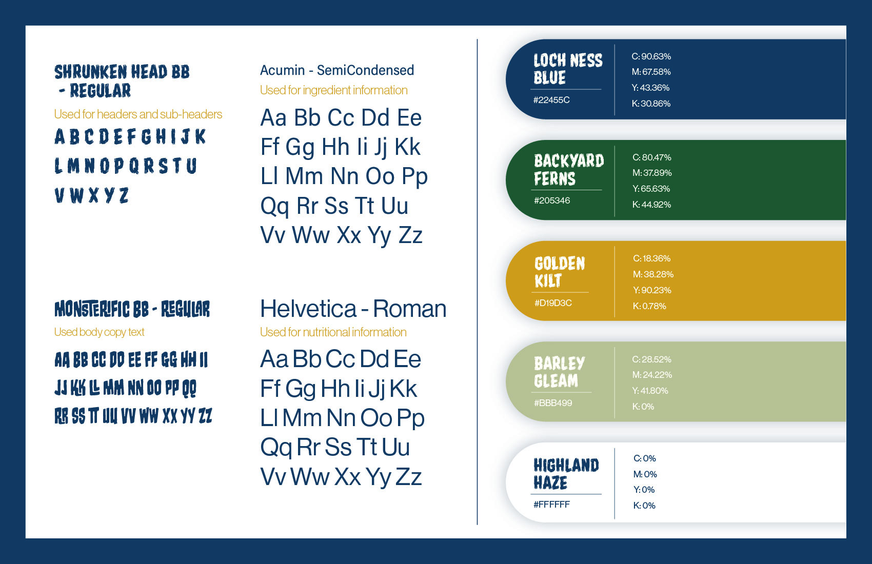
Typography & Colors:
The typeface Shrunken Heads BB- Regular was chosen as the main typeface for all headers, sub-headers, and body copy. I chose this typeface because it combined the feelings of 'cool, but don't talk about it' that most beer packaging has and also the rugged, wild feeling of a sea monster. I also had to consider what a typeface would look like when it was warped.
The typeface Monsterific BB was chosen as the typeface for the brand Backyard Brewing due to it's fun and unique look, while still being approachable and legible across different formats.
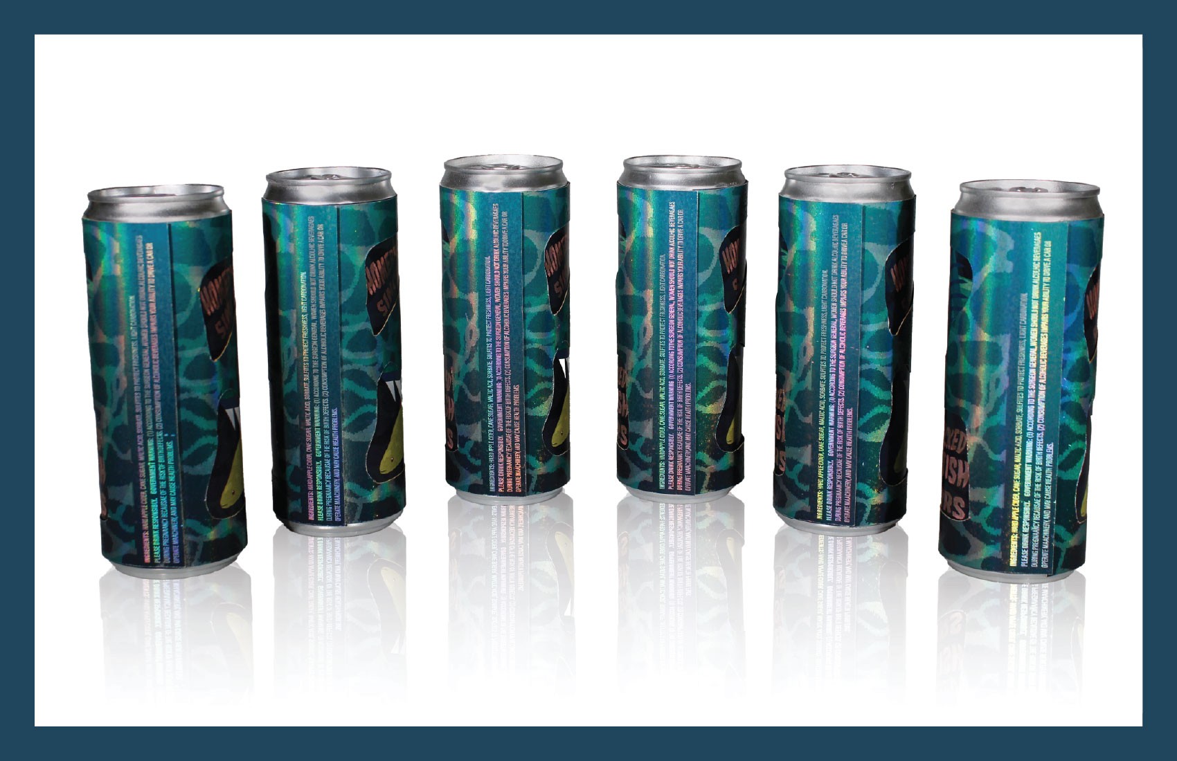
I used Acumin for my ingredient list, all necessary government and health disclaimers, and the company contact information. I chose this typeface due to the kerning and width of the letters and how legible it is when printed at a small size.
For this design, I used a mostly cool toned color palette. I stuck with mostly blues and greens to create an underwater scene that includes the Loch Ness monster. I carried these blues and greens into the main label of beer, but placed on a white background so it would stand out.
I also used a yellow to make certain parts of the design stand out, mostly the eye of the monster and the fish that the monster is about to swallow.
Finally, I used a tan color on the main label for the alcohol content and fluid ounces. I chose this color because it kept with the overall nature themed color palette, but stood out from the blues and greens used in the product's name.
Clinical photos: